The widgets
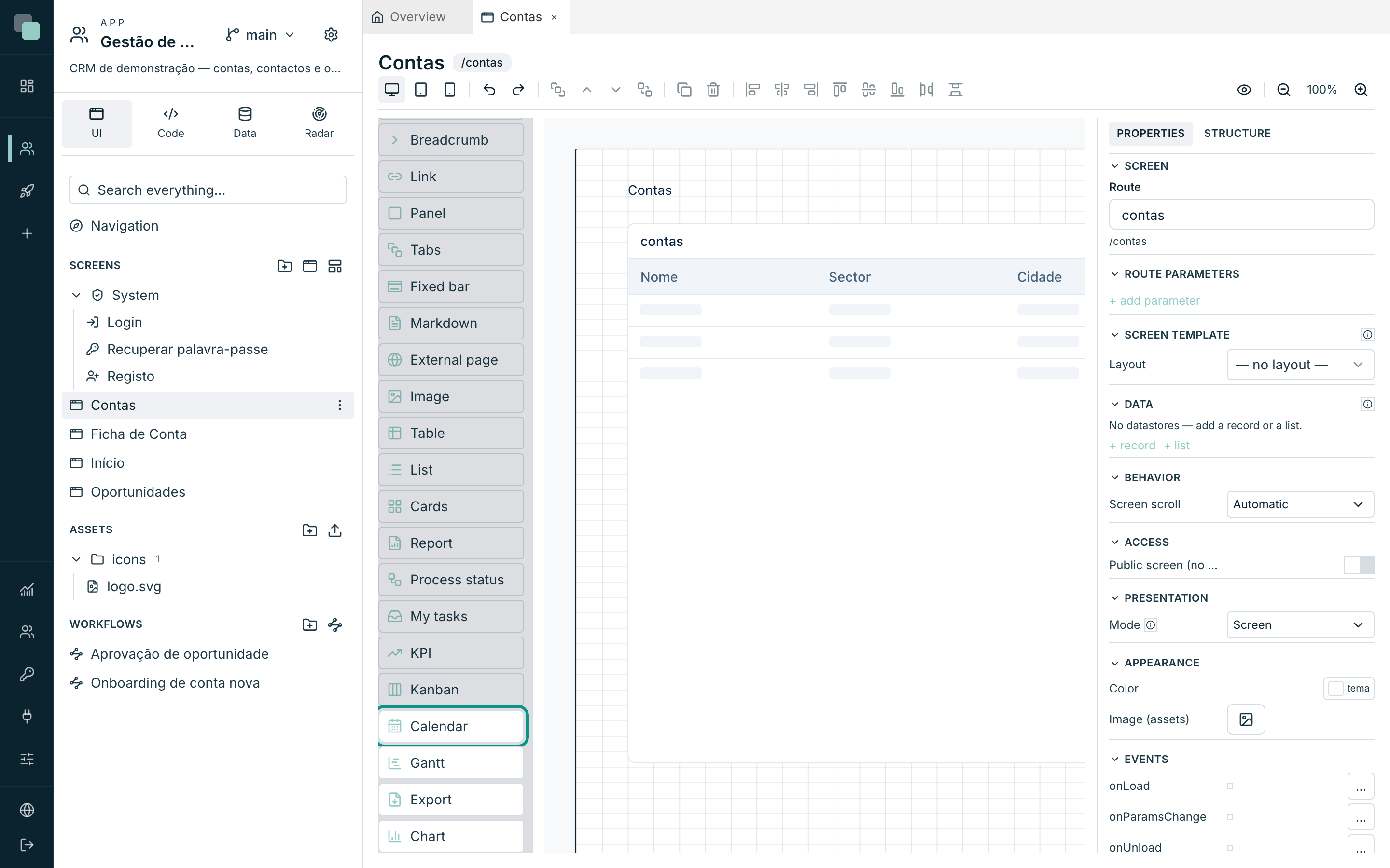
The complete catalogue of the 33 widgets — what each one does, and in detail the Table, the forms, the Chart, the KPI, the Kanban, the Calendar and the Gantt.
Everything you see on a screen is a widget. The Widgets palette, to the left of the canvas, ships with 32 widgets — you leave this page knowing what each one is for, and with the main ones explained in detail. If the app has widgets programmed by you, they appear on the same palette, in the Custom section.
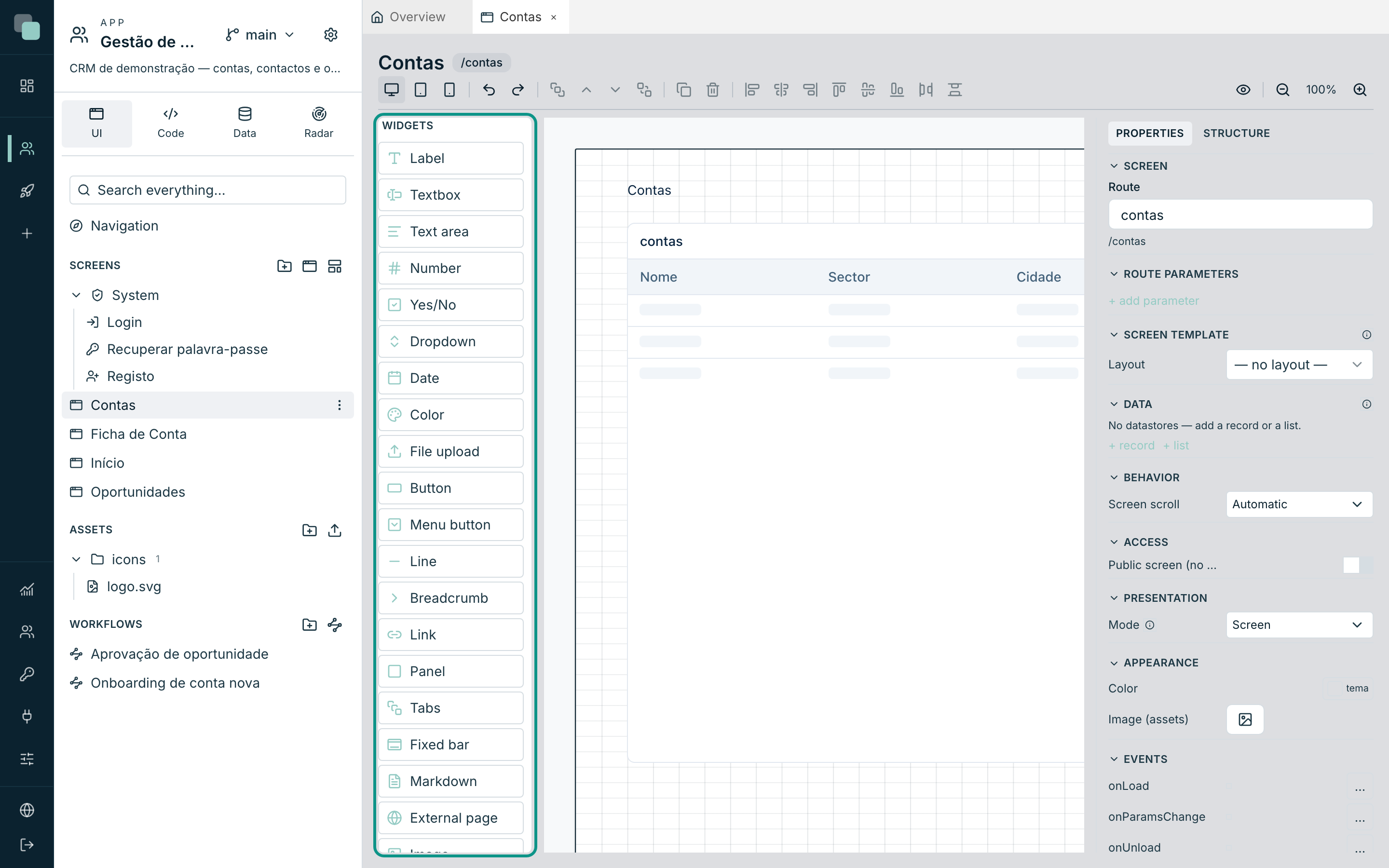
The catalogue, by category
Form fields
They all bind to a field of a record datastore (Data binding section) and enter the validation — see the forms.
| Widget | What it is for |
|---|---|
| Textbox | Single-line text. Has Mask, Password (hide text) mode and placeholder. |
| Text area | Long, multi-line text — notes, descriptions. |
| Number | Numeric values. |
| Yes/No | A boolean switch. |
| Dropdown | Choice of options: Fixed list, Model enum or Datastore; with Searchable, Multi-select and Tree (hierarchical) mode. |
| Date | Date, Date & time or just Time (the Type field decides). |
| Color | Choice of a colour. |
| File upload | Upload by drag and/or button, with preview, size limit and choice of storage. The limit never goes above the Max file (MB) in the platform settings, up to 100 MB. With In the field itself (base64), the file goes inside the request and the limit is about 3 MB. Each account can send up to 300 files and 3 GB per hour (and each address up to 20 GB); above that, the widget says too many files were sent and asks to try again later. |
Every field with a value shows a discreet × on the right that clears it — in a List used as a filter it is how you go back to "all" without picking anything. The plain List opens its options below the field; with Searchable it opens a search box and the list shortens as you type; with Multi-select each option toggles with a check mark.
The Dropdown shows 10 options at a time. The Visible options property, under Behavior, changes that number (0 shows all of them). When there are more options than that number, the list gets a search box, even without Searchable, and a footer with the total, for example "10 of 245 · type to search". The search looks through every option and ignores accents and capital letters. In a Multi-select, the options already chosen appear first in the list, and the field shows the first two followed by "+N".
In the footer, the magnifier (See all) opens a window with every option in a table, with search and 50 rows per page. With the Options source set to Datastore, the Picker window columns add fields next to the label (for example, the tax number, to tell apart two customers with the same name), and the window gets a filter bar over those fields. In a single choice, clicking a row picks the option. In a Multi-select, each row has a checkbox, Select all selects the results on every page, and only Apply saves the choice; Cancel changes nothing. The window always keeps the same size, with few or many results.
In KeplinGo, the Dropdown opens a sheet with the same rule: 10 options, search, and the footer with the total. See all shows every option in the same sheet, with the fields of the Picker window columns under each label, and a Multi-select only saves with Apply.
With the Loading of the Dropdown datastore set to One page at a time, only the first page reaches the screen. The search then asks the server, the footer total is the server's, the picker window requests each page from the server, and the field fetches the name of a saved value that the first page did not bring. In this mode, the search looks in the label (which must be a text field), capital letters and accents count as the database counts them, and Select all does not appear, because it would have to bring every record.
Actions and navigation
| Widget | What it is for |
|---|---|
| Button | The classic action. Show: Icon + Text, Icon only or Text only; the Click action navigates, opens a modal or runs code. |
| Menu button | A button that opens more options. Look: Split (the body acts, the arrow opens the menu), Menu or Hamburger. Each option can hide or disable itself by conditions. |
| Link | Clickable text — Target: App screen (with parameters) or External URL (with Open in a new tab). |
| Breadcrumb | The "you are here" path, with clickable levels and the last level fixed or bound to a field. |
| Export | A button that downloads a datastore's data as a spreadsheet (.xlsx) — chosen fields, optional Header row and File name with {date}. |
Export reads the data at the moment of the click, in blocks, up to
50,000 rows; above that, the file comes out with the first 50,000 and a
warning appears. The onExport event says whether the file was cut
(truncated).
In KeplinGo the file comes out as CSV; text that Excel would read as a formula
(starting with = or @, for example) gets an apostrophe in front.
Structure
| Widget | What it is for |
|---|---|
| Panel | A container with a frame and a title — it tidies up widgets, which now move together. |
| Tabs | A container with tabs; each child widget belongs to one tab. Tab style: Boxed, Pills or Underline. |
| Fixed bar | A full-width bar, pinned to the Top or the Footer of the screen — for always-visible action bars. |
| Line | A separator line, Horizontal or Vertical — the colour and stroke come from Appearance. |
Content and media
| Widget | What it is for |
|---|---|
| Label | Plain text — titles, captions, loose values. Accepts Phrase values ({n} in the text). |
| Markdown | Rich text written in Markdown — fixed or coming from a field. |
| Image | An image by Fixed URL, app Asset or Field (dynamic); Fit: Contain, Cover or Fill. |
| External page | Embeds an outside page (a map, a video, third-party BI) or HTML written by you. It runs isolated: it sees neither the session nor the app's data. |
Data
| Widget | What it is for |
|---|---|
| Table | The grid of records — typed columns, sorting, selection and action buttons. Detail below. |
| List | Records in a vertical list, with fields in roles (Title, Subtitle, Body, Caption) and an optional image. |
| Cards | The same template as the List, but as a grid of cards with N Columns. |
| Chart | Drawn series — bars, lines, pies and more. Detail below. |
| KPI | A strip of numeric indicators with trends, target and sparkline. Detail below. |
| Filter bar | Conditions as chips (field, operator, value) that filter a Table, List, Cards, Kanban or Chart on the screen. Details below. |
Boards and planning
| Widget | What it is for |
|---|---|
| Kanban | Cards draggable between status columns. Detail below. |
| Calendar | Events in Day/Week/Month/Year views. Detail below. |
| Gantt | Start→end bars with progress, groups and dependencies. Detail below. |
Documents and processes
| Widget | What it is for |
|---|---|
| Report | Shows an app report (PDF) inside the screen, with parameters bound to what is on the screen and an Action bar to refresh and download. |
| Process status | The history and current step of a record's workflows, with decision buttons when the open task belongs to whoever is looking. |
| My tasks | The workflow task inbox of the signed-in user — it opens the task's screen and decides from there. |
The Table
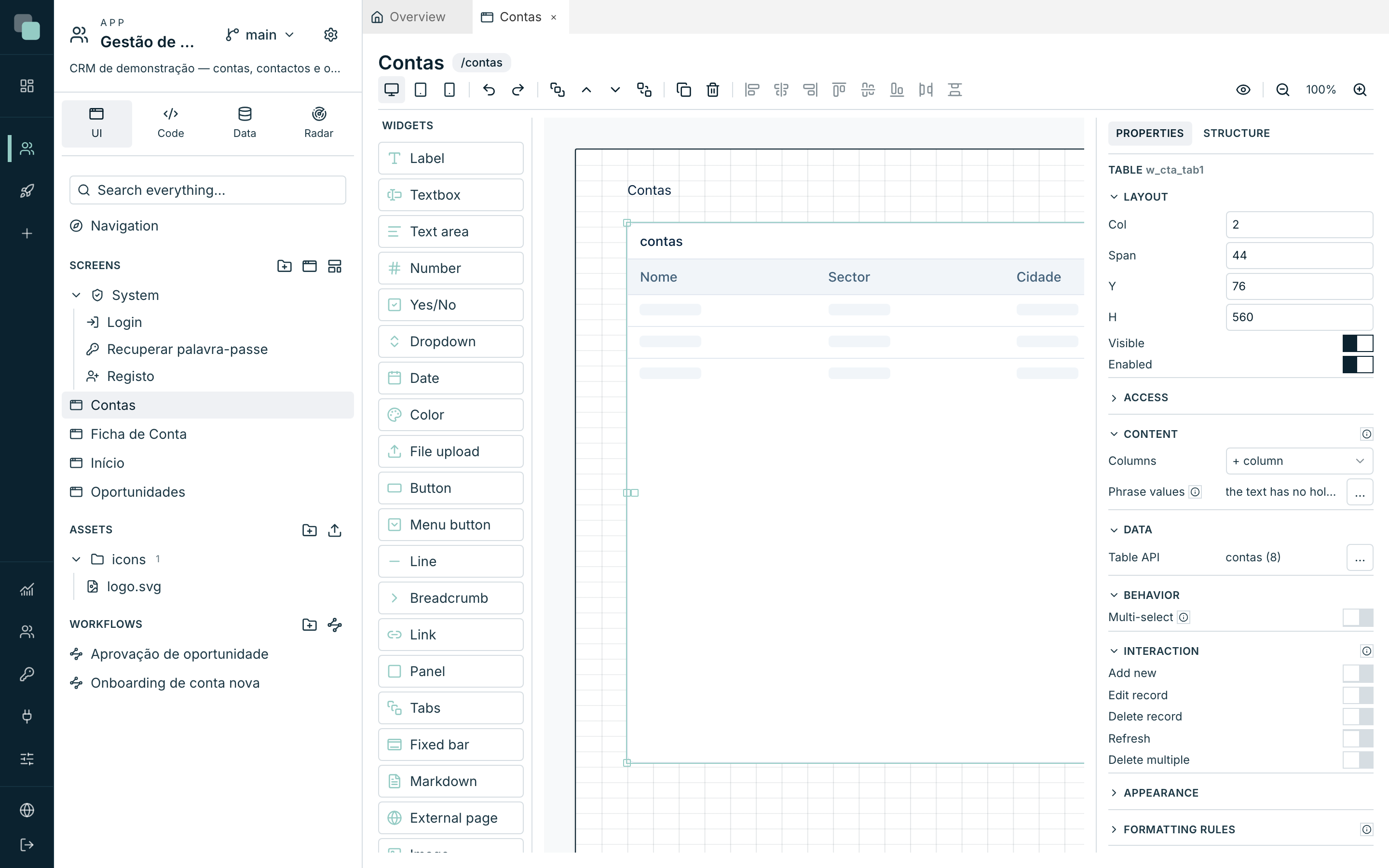
The Table is the platform's most used widget: it binds to a list datastore and shows the records in a grid, with paging, sorting and selection.
The footer with the total and the page arrows only appears when the records do not fit on one page. The same applies to the List and Cards widgets.
Dates that come from the API are shown in the app's language, and a day-only column shows only the day.
Columns
When you bind the datastore, the columns are born one per field. Then you fine-tune: under Columns, use + column to add, and click a column on the canvas to edit it — the inspector switches to it.
Each column has a Header, Width, Sortable by header, Hidden — and a Type:
| Type | What it does |
|---|---|
| Text | The value as it is, with an optional Mask (# = character). |
| Number | Formats the value: Number (regional) (with Decimal places, Thousands separator, Compact — 1.2M instead of 1,234,567 —, Prefix and Suffix) or Mask (# = digit). |
| Link | The cell becomes clickable. Target: App screen (with parameters coming from Row field, URL parameter or Fixed value) or Script — your code running on the click. It is the right column for opening a record from the list: the column that identifies the row (name, description, date) leads to the record screen with the row id; a screen in modal or side-panel mode opens on top and the list reloads when it closes. |
| Image | Shows the image whose address/content is in the field. |
| File | A download link for the file referred to in the field. |
| Sparkline | A small chart per row, in Lines or Bars, with no axes or labels. The series comes from a Field with a list (a list of numbers in JSON or from the API, or a text such as 3,5,4) or from Several fields of the row, one point per field. You can choose the Colour, Show last value beside it, and a fixed Scale (minimum and maximum) to compare rows with each other. This column does not sort from the header. |
A column of a relation field (customer.name) does not sort by its header:
sorting runs on the server, which only knows the fields of the table itself.
The table's actions
In the Behavior category, the actions section creates the CRUD buttons: Refresh, Add new, Edit record, Delete record and Delete multiple. Each enabled action creates a loose button on the canvas, linked to the table — you position and style that button like any other.
- Add new and Edit record open a screen or a modal of your choice (typically the record's form), with the parameters filled in from the row.
- Edit record and Delete record only become enabled with a row selected; Delete multiple works over the Multi-select (the switch that adds the checkbox column).
- The actions that write require the datastore to have a primary key — the inspector warns: The datastore needs a primary key.
Note
Deleting the table also deletes the action buttons linked to it — an "edit record" button with no table makes no sense. Undo puts everything back.
Forms (inputs + record + validation)
There is no "form" widget: a form is the sum of three pieces, and it is that freedom that lets you draw the record card however you want.
- Create a record datastore on the screen (see
Datastores and data) — for example,
conta, loaded by the key coming from the route'sidparameter. - Drag the form fields (Textbox, Dropdown, Date…) and, on each one, point the Data binding at the right field of the datastore.
- Add a "Save" Button whose event saves the datastore — the pre-defined Save datastore action of the event editor writes the code for you (see Events and the SDK).
Validation lives on each field, in the Validation category:
- Required — the field has to come filled in.
- The standard rules: Min characters, Max characters, Is email, Is phone, Is number, Min value, Max value, Pattern (regex) and Equals field (password confirmation, for example).
- Validation with a script — for logic of yours: the code receives
value(the field's current value) and returnstrueif valid, or the error message. A tax number, an IBAN, a business rule.
On save, the validation all runs: required fields first, then the rules, then the script. The record only goes through if everything passes.
A field with an error gets a red border, and the message appears below it, in the space between widgets. The field and its label stay in place. For the message to show in full, leave at least 16 pixels between a field and the widget below it, and between a field and the bottom of the panel or tab that contains it.
The Chart
The Chart binds to a datastore and draws series. Under Chart type you choose: Bars, Line, Area, Pie / Donut, Scatter, Radar, Gauge, Funnel or Heatmap.
The essential part is the mapping, in the Data category:
- Category field (X axis / slices) — what separates the bars/slices.
- Value fields — one or more numeric fields; each one is a series.
- Series field (grouping) — as an alternative to the several values: it pivots by the first value field and creates one series per distinct value (with no values, it counts records).
And then the finishing touches:
| Option | What it does |
|---|---|
| Stacked, Horizontal, Smooth lines, Point labels | Variations of the drawing, depending on the type. |
| Legend, Legend position, Tooltip | The chart's chrome. The legend can also be dragged directly on the chart to position it. |
| Value format | The same format as the table's Number columns, applied to axes, labels and tooltip. |
| Value scale | Linear or Logarithmic — logarithmic is for when the series differ by orders of magnitude. |
| Use a second axis | An axis on the right with its own scale — for putting a euro total and a count on the same chart. |
| Series | Type per series (bar and line combos) and which series go to the 2nd axis. |
| Advanced options | A code editor with all the chart engine's properties, with autocomplete — applied on top of the configuration, for the cases the fields do not cover. |
The KPI
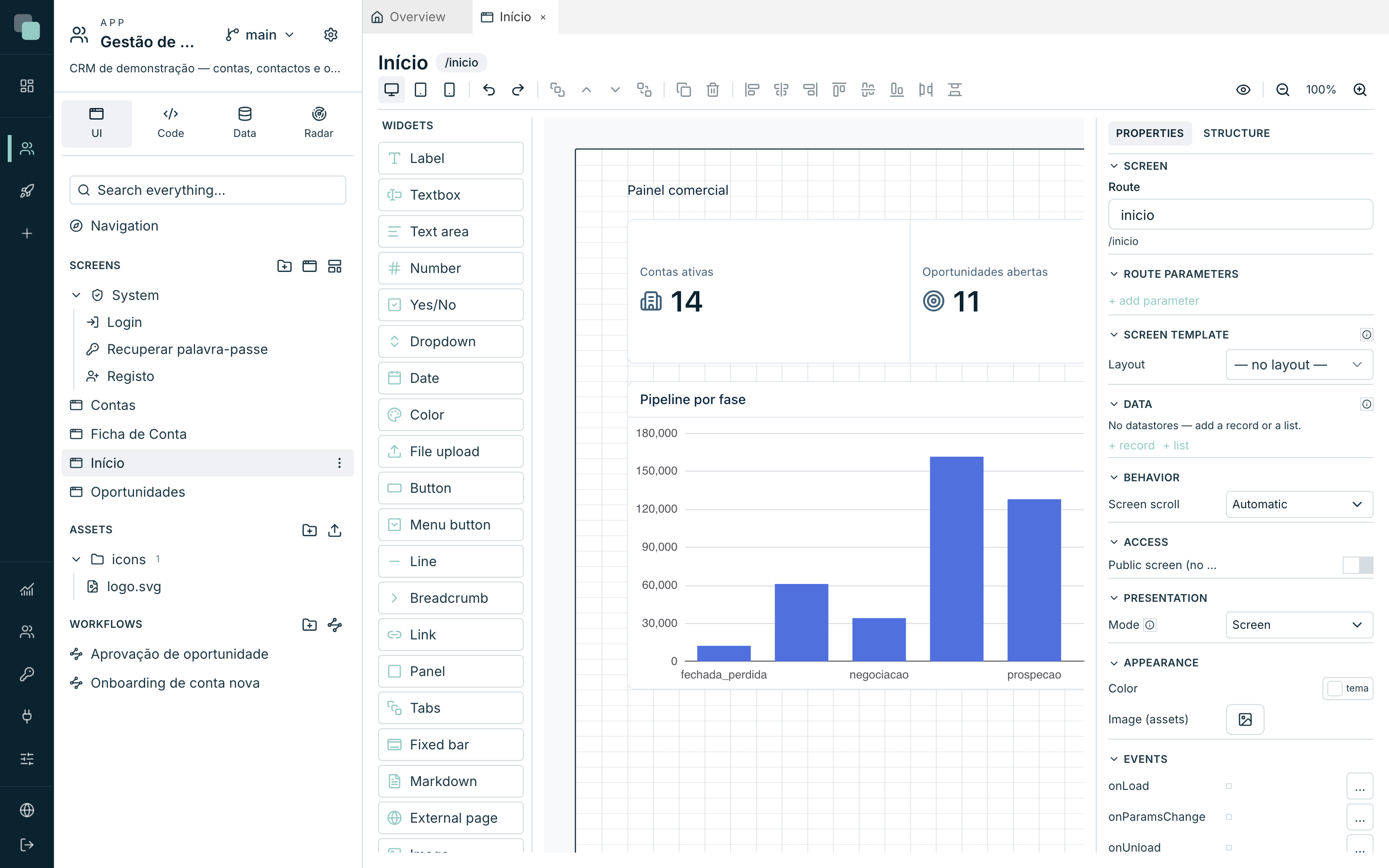
The KPI is a strip of indicators — four numbers side by side are made with one widget of four indicators, not with four widgets: the alignment and the spacing come guaranteed.
Each indicator (under Indicators ▸ Add indicator) has:
- A Label and icon, with Caption position (Above the value / Below the value).
- Value (field) + Aggregation (Sum, Average, Count, Maximum, Minimum, First, Last) over the dataset — or a Manual value when there is no data bound.
- Trends (Add trend) — comparisons under the number, with a Reference field, Percentage or Absolute value format, and Lower is better (invert colors): on rising debt, the arrow has to be red.
- A Target — No target, Manual value or Datasource field, with an optional Progress bar.
- Show sparkline — the little history line, with a Series field.
- Period (from field) — which close the number refers to (an ISO date is shown as MM/YYYY).
The dataset is shared by the widget, but each indicator can have an Own dataset.
Tip
Going to show one number? It is a KPI. The Chart is for series — using a chart for a single number is the recipe for a poor screen.
The Kanban
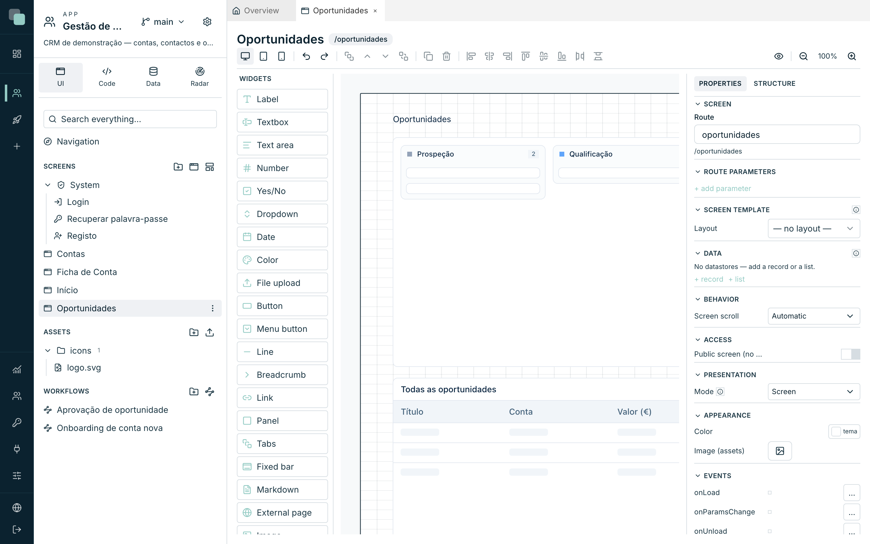
The Kanban shows records as cards in columns — the opportunities pipeline of Customer Management is a kanban by status.
- Bind the datastore and choose the Status field (column) — the field that says which column each card is in.
- Set the Columns source: Static (you add each column with a Label, a Value and a colour) or Enum (the columns come from the values of a model enum).
- Compose the Card template — the fields and roles, as in the List.
With Allow dragging cards on, moving a card saves the new status to the record right away. An Order field (a numeric field) makes the ordering within the column persistent. Uncategorized column catches the records whose status matches no column; Card count shows the total in the header.
The actions: Card click (edit) and Create card (column button) — each one can navigate to a screen, open a modal (with the row's and the column's parameters) or emit an event for your code.
Warning
Dragging requires a primary key in the datasource — without it, the Kanban has no way of saving the column change, and dragging stays off.
The Calendar
The Calendar shows records with a date as events, in the Day, Week, Month and Year views.
- Fields: Date field (start), End field (optional) (multi-day events), Title field.
- Event color: Single or By field — with a value → colour map (a type enum, for example).
- View: Initial view, Available views, First day of the week (Monday/Sunday), Max events per day in the month view, Start/End hours in the day/week views, Navigation bar and View switcher buttons.
- Actions: Event click (edit) and Day/range selection (create) — the start/end travel to the target screen as parameters, ready to pre-fill the creation form.
The calendar only loads the records of the visible range — changing month fetches the new month, not the whole table.
The Gantt
The Gantt draws start→end bars on a timeline — project planning, campaigns, customer onboarding.
- Fields: Start field, End field, Label field, Progress field (0–100) and Group field (groups rows).
- Dependencies field — the IDs (primary key) of the predecessors, as a JSON list or comma-separated; the Gantt draws the arrows.
- Initial zoom (Day, Week, Month), Today line and Shade weekends.
- Actions: Bar click (edit) and Empty area click (create) — the clicked date travels as a parameter.
The Gantt is read-only: the bars are not dragged — the dates are changed on the record's form.
The Filter bar
The Filter bar lets the people using the app filter a list by any field, without you drawing a filter field for every column. It sits above a Table, List, Cards, Kanban or Chart and writes the conditions as chips.
- Drag the Filter bar onto the screen and, under Data, choose the Target widget — the list widget whose datastore receives the conditions.
- Under Filterable fields, pick the fields to offer. With no choice, the
bar offers every simple field of the target's datastore; the table's column
headers serve as labels.
Relation fields (
customer.name) are not offered: the filter runs on the server, which only knows the fields of the table itself. - Optional: under Visible values, choose how many suggested values the list shows at a time (10 by default; 0 shows all of them). The search always looks through every value, and a footer says how many there are. In the value step, the magnifier in the footer opens the picker window with every value of the field.
In the app, each condition is written in three steps, always in view: the field, the operator and the value. The options for the next step appear on their own; typing filters them. Suggested values come from the loaded data, but whatever you type always counts, even if it is not in the list.
Operators depend on the field type: text (contains, equals, starts with…), number and date (comparisons), and lists (equals, not equal to). Any of and none of take several values in the same chip: each pick goes in, and Enter or Apply closes the condition. The × on a chip removes that condition; the × on the bar clears everything.
When a condition closes, the list does not open again by itself: the bar stays ready for typing. For another filter, type, click the bar or press ↓.
The conditions join those of the target's datastore (Filters (where)) and the request goes to the server with paging — filtering never fetches the whole table. Widget-bound filters (a List bound to a datastore condition) still exist and can live on the same screen: the quick dropdown for the most used filter, the bar for everything else.
In date fields, you write the value the way you read it: "26/09/2026", "26-09-2026", "26.09.2026" or "2026-09-26", with or without a time. When the day and the month could be swapped, the day comes first. A date without a time covers the whole day: at most 26/09/2026 includes that day's records, and greater than 26/09/2026 starts on the next day. Not equal to and none of include records where the field is empty.
Why doesn't…?
- Why doesn't the Validation section appear on my widget? Only form fields validate — a Button or a Label have no value to validate.
- Why does the widget appear on the palette but grey on the canvas? It is disabled (the Enabled switch in the Layout category) or a rule/event disabled it.
- Why don't I see data on the canvas? The canvas shows samples — the real data appears in the preview and in the published app. Check the binding in the chapter Datastores and data.
- Why does the Filter bar say "No target widget"? The Target widget under Data is missing — only widgets with a list datastore (Table, List, Cards, Kanban, Chart) can be targets.