App navigation
The navigation editor — menus, groups and contexts, the logo, the user menu, value pills, and a separate design for web, tablet and mobile.
Screens are the pages; the navigation is what takes people to them. In Keplin it does not live inside any screen: it is a document of the app's own, designed in a visual editor and served around whatever screen is open.
And it is designed per device: the computer's top bar, the phone's drawer and the tablet's action bar are three independent designs, each with its own menus.
Opening the editor
In the app sidebar, UI tab, the first item is called Navigation. Click it and it opens in a workspace tab.
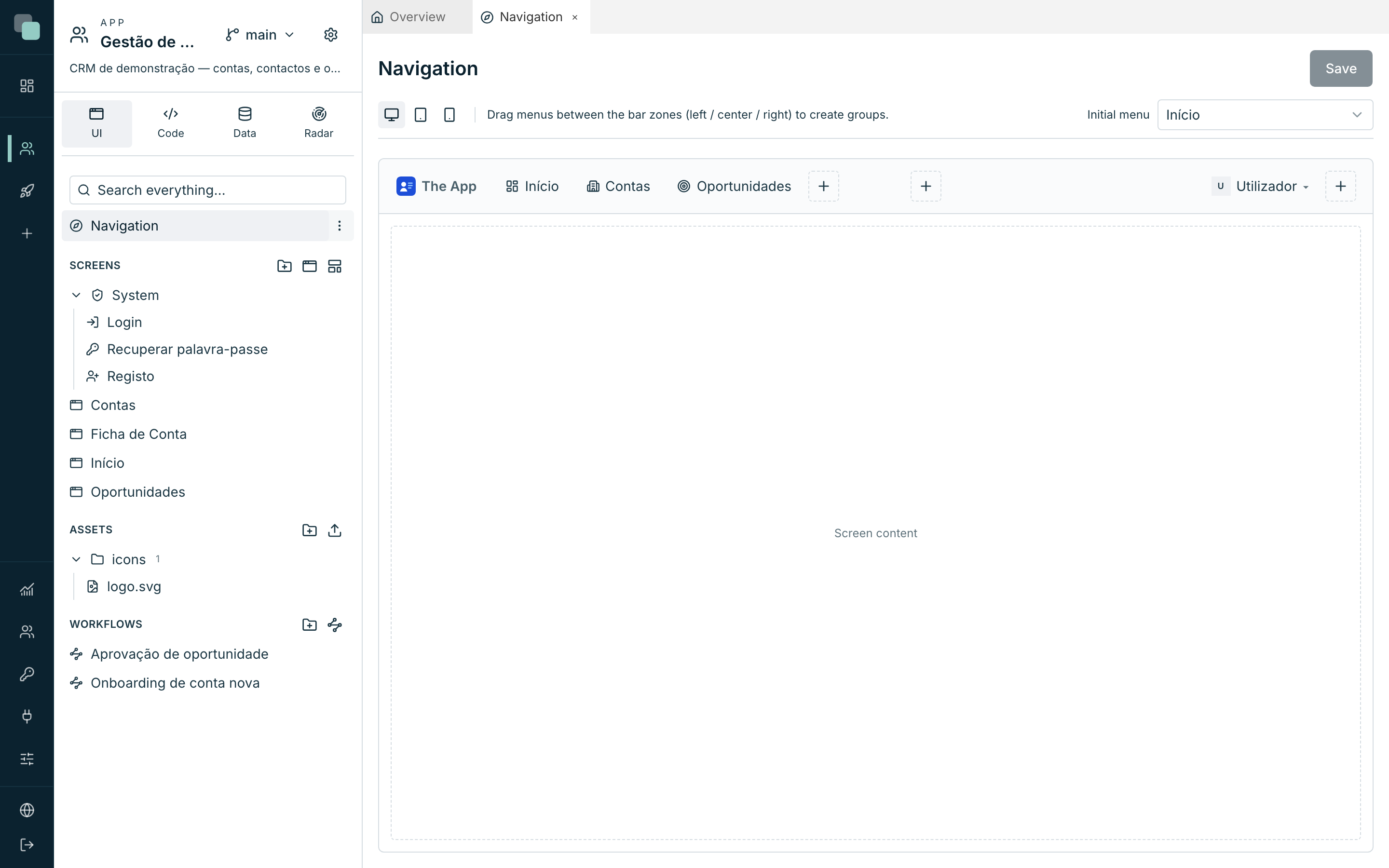
What you see in the middle is not a form: it is the app's page, drawn as it is going to look. The bar on top, the screen's content underneath (Screen content), the brand on the left. You edit by handling it.
Warning
Unlike the screen designer, the navigation does not save itself. The Save button, in the top right corner, becomes active when there are changes — and the platform confirms with Navigation saved. The tab is marked as unsaved until you press it.
Below the title sit the controls that govern what you are looking at:
| Control | What it does |
|---|---|
| Web (1280px) / Tablet (768px) / Mobile (390px) | Picks the device you are designing. |
| Mode (tablet and mobile only) | The shape of the navigation on that device. |
| Initial menu | Which of the menus opens when someone enters the app. |
The gestures
| Gesture | What happens |
|---|---|
| Click on a menu | Selects it (and, on a context, shows its sidebar). |
| Double-click on a menu | Opens the Selected item dialog, where everything is edited. |
| Drag a menu | Moves it between zones or reorders it. It only drops where it is valid. |
| + | Adds a menu in that spot. |
| × on a menu's corner | Removes it. |
| Click on the brand | Opens the App logo dialog. |
The menu types
The + button of each zone shows the types that spot accepts:
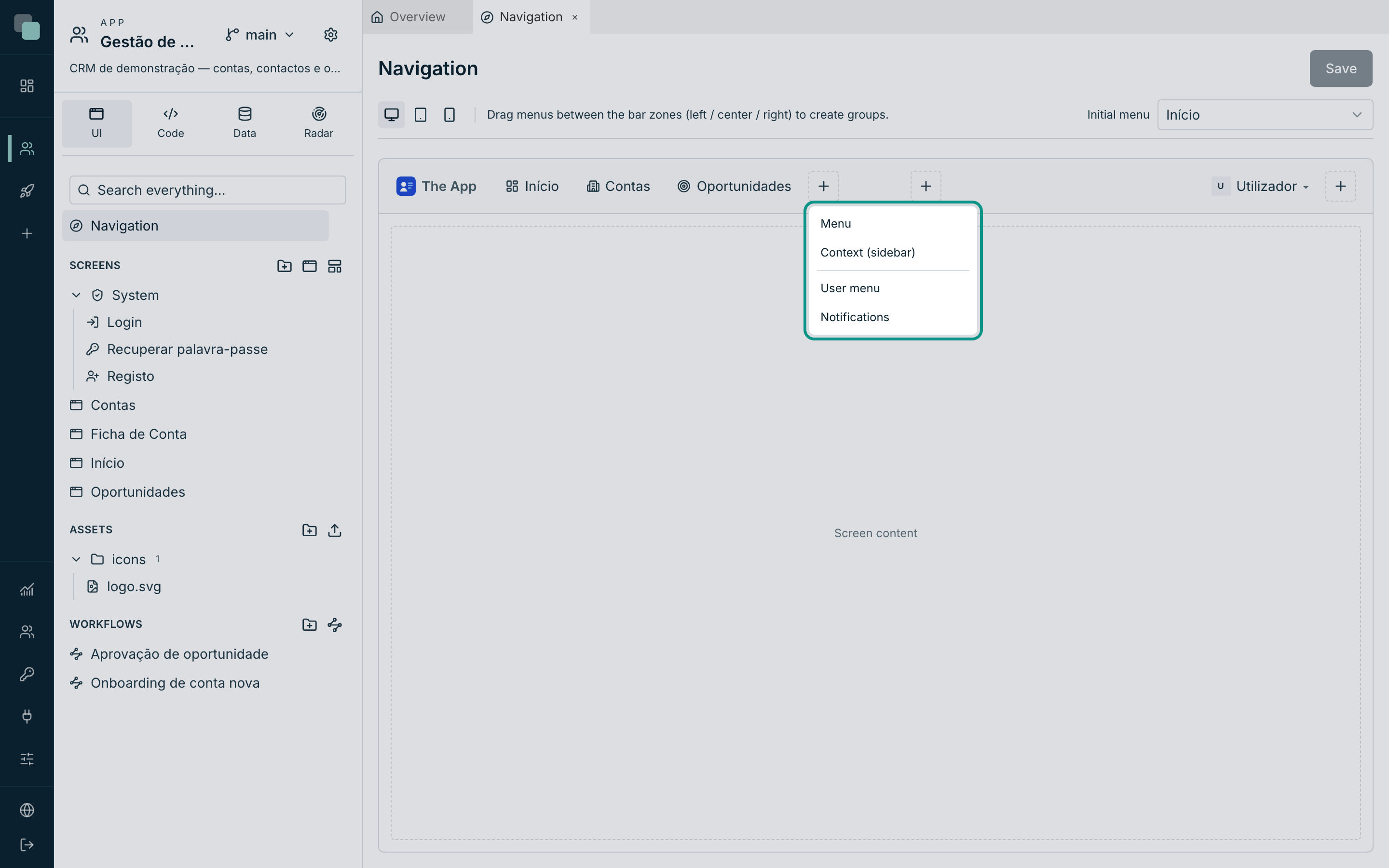
| Type | What it is |
|---|---|
| Menu | Leads to a screen of the app. It is the normal item. |
| Submenu | Groups other menus — in the drawer and in the sidebars. |
| Context (sidebar) | A menu that, when chosen, activates a sidebar of its own with its children. It is as if it split the app into areas. |
| Separator | A dividing line. |
| User menu | The avatar of whoever is using the app, with its entries and the Sign out. |
| Notifications | The bell, with the automatic unread count. |
| Language | The language selector: the app's languages, each in its own name. |
| Widget area | A bar screen drawn inside the bar: a dropdown to choose the company, a summary, a search. |
Not every type works in every spot, and the editor only offers the valid ones: a context cannot contain another context, a submenu only takes items, the user menu only takes items, separators and the language, and the phone's drawer has no contexts (use submenus).
Note
A menu always points at a screen of the app — there is no "external link" item. To take someone outside, make a screen with the External page widget, or a Link inside a screen.
The bar's zones
In the top bar, the menus are arranged in three zones, and the hint in the editor says the essential: Drag menus between the bar zones (left / center / right) to create groups.
| Zone | Usual use |
|---|---|
| Left group | The main navigation, right after the brand. |
| Center group | A highlighted group. If it stays empty, it takes no space. |
| Right group | The user menu, the bell, shortcuts. |
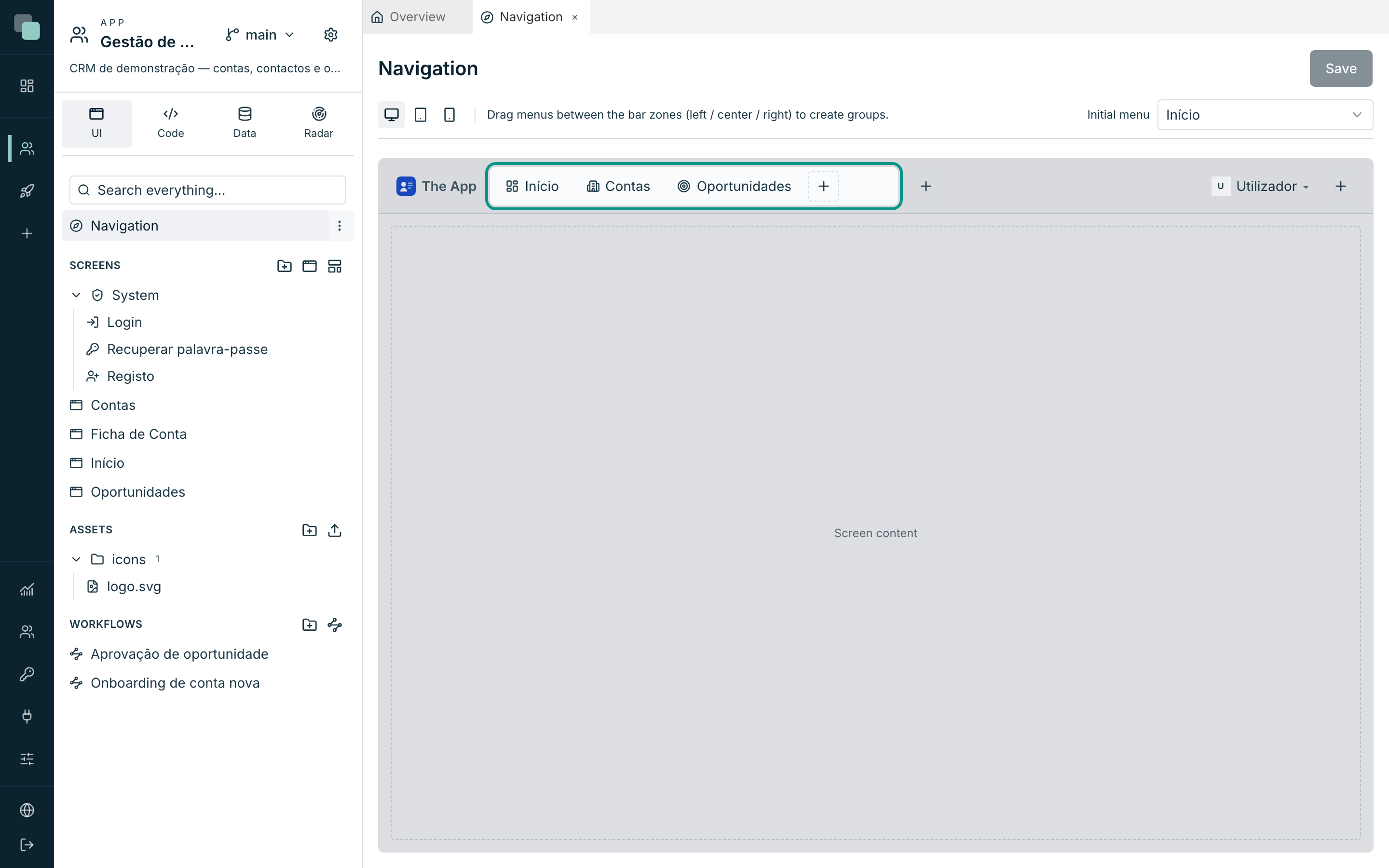
Inside a context's sidebar — and in the drawer — there are two zones: Top group and Bottom (this one sticks to the bottom, so "Settings" and "Help" sit where people expect them).
Creating a menu
- Choose the device in the context bar.
- Click the + of the zone where you want it.
- Choose the type.
- The menu is born with a generic name and stays selected — double-click it to open the Selected item dialog.
- Fill in:
| Field | What it is |
|---|---|
| Icon | An icon from the library or an SVG from the app's assets. |
| Menu label | The text that appears. It is a phrase of the app — it enters the translations. |
| Screen… | The destination screen (only on Menu). |
| (parameters) | If the destination screen has route parameters, a field appears per parameter for you to give it a fixed value. |
| Icon only (name shows as tooltip) | Leaves only the icon in the bar. |
- Close with Done and save with Save.
The Delete item button, in the same dialog, deletes the menu.
Contexts and sidebars
A Context (sidebar) is the way of giving an area of the app a menu of its own: you pick "Sales" in the top bar and the sidebar with the sales screens appears on the left. The context's children are the items of that sidebar.
In the context's dialog, the This context's sidebar section tunes it:
| Field | Options |
|---|---|
| Behavior | Fixed (always open) · Collapsible (button collapses to icons) · Mini (icons; expands on hover) · Mini with panel (hover opens the menu's tree) |
| Width | Between 180 and 400 pixels. |
| When expanding (mini mode only) | Overlays the content or Pushes the content. |
| Starts collapsed (collapsible mode only) | How it opens the first time. |
The sidebar stays open while you move around the area, including pages that are not in any menu (a detail page opened from a list), and also after a reload. A screen from another context switches it, and a top bar item without a context closes it. For a detail page to highlight the right menu even on a direct link, choose the Parent screen in the screen's properties, in the Navigation category.
The user menu
The User menu is an item like the others: it can sit in the top bar, inside a context, in the drawer or in the compact bar. Selecting it opens its popup, and that is where entries are added with the + (Menu, Separator or Language).
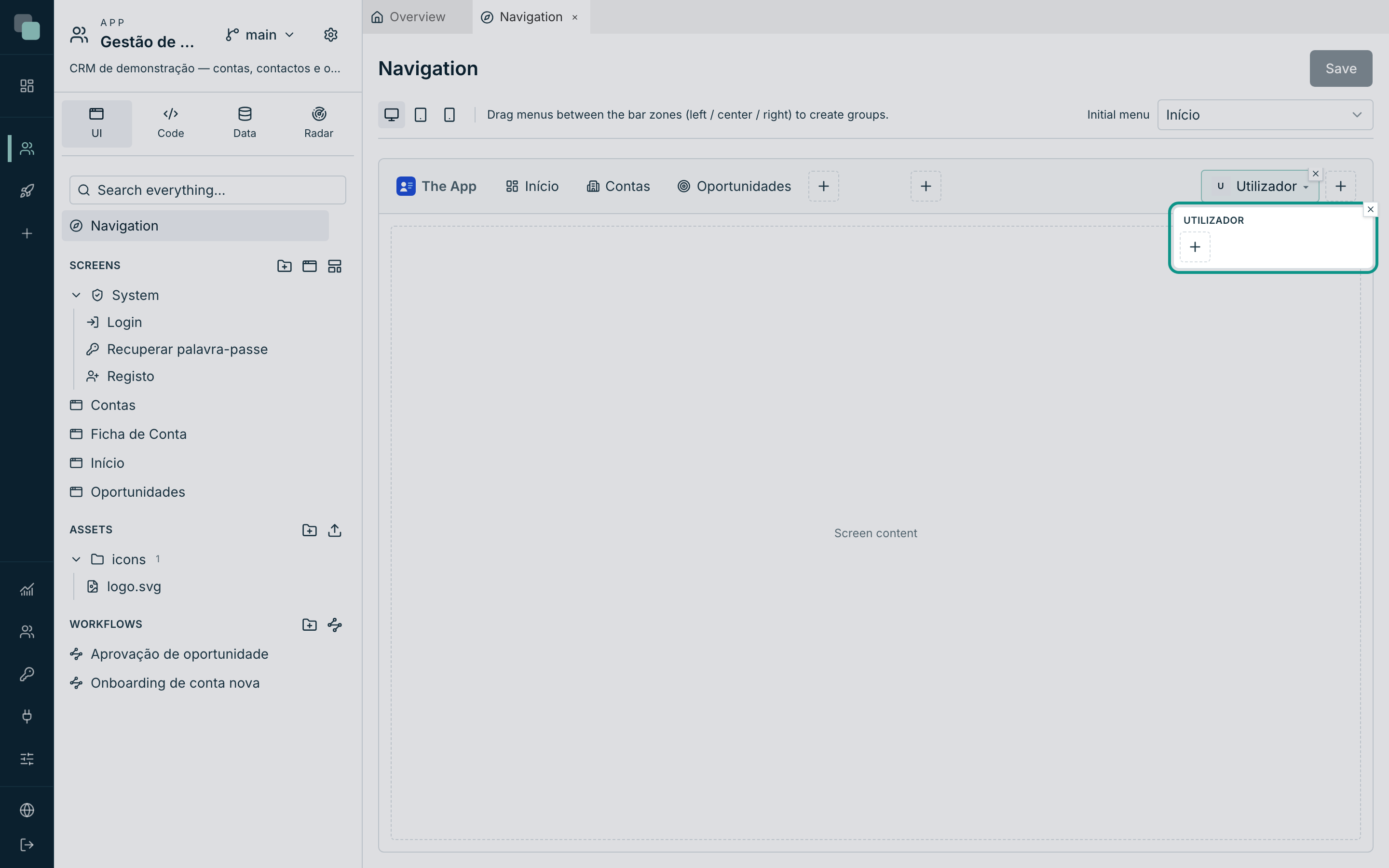
The dialog holds the options that are not visual:
| Option | What it does |
|---|---|
| Show name | The name of whoever is using appears in the menu's header. |
| Show username (login) | The username too. |
| "Sign out" option | Includes the sign-out at the end of the menu. |
| "Sign out" text | A text of your own; empty uses System default (translated). |
With no icon, the avatar shows the initials of the name — and that is what the icon picker calls No icon (initials).
Notifications
The Notifications item is the bell: icon only, with the unread pill updating itself. Clicking opens the latest notifications and See more opens the panel with all of them. In the dialog, Notifications in the dropdown decides how many appear at a time (between 1 and 20).
Language
The Language item is the language selector. It shows the app's languages, set in the Translations section of the settings, each in its own name ("Português", "English"), so that someone who does not understand the current language can find theirs. Choosing a language switches the app's texts without reloading the page, and the choice is saved on the device.
It can sit in the top bar, in a sidebar, in the drawer, in the compact bar and in the action bar. Inside the User menu, it appears as the entry "Language · English", which opens the list right there. In the dialog, Show the current language decides what the button shows: Name (English) or Code (EN).
In an app with a single language, the selector does not appear.
On the first visit, before anyone chooses, the app opens in the browser's or
phone's language if the app has it; otherwise, in the base language. A screen
without menus, such as the login screen, can offer the choice with a button that
calls keplin.i18n.setLocale.
Widget areas
A Widget area puts widgets in a bar: a dropdown to choose the company in the top bar, or a summary at the bottom of a context's sidebar. The content of the area is a screen of the app, drawn in the designer like any other, with the Bar (widget area) presentation.
To create a widget area:
- In the Screens section, create a screen.
- In the screen's properties, in the Presentation category, choose Bar (widget area) in Mode.
- In Width (px) and Height (px), set the size of the area. By default, it is 320 by 48 pixels.
- Draw the widgets.
- In Navigation, click the + of the zone where you want the area and choose Widget area.
- Double-click the item and, in Area screen, choose the bar screen.
- Click Save.
The item's zone decides where the area appears and at what size:
| Where the item is | Where the area appears |
|---|---|
| Left group, Center group or Right group of the top bar | In the top bar, with the screen's width and height. |
| Top group or Bottom of a context's sidebar | In the sidebar, with the bar's width and the screen's height. |
| Drawer | In the drawer, with the drawer's width and the screen's height. |
| Header | Next to the brand, with the screen's width and height. |
The area does not go in the action bar or in the user menu. In a sidebar collapsed to icons, it does not appear.
The area stays open while you navigate: the data loads once and the choice made is kept when the page changes. In KeplinGo, the area works the same way in the header and in the drawer.
Connecting the area to the pages
The area and the pages communicate through the app state: named values, the same on every screen. For example, for a dropdown in the top bar to filter the pages by the chosen company:
- In the area's dropdown, in Data binding, choose State and type the
Key
company. - In the pages, in a datastore filter, choose the State source and type the same key. The list reads the data again when the choice changes.
- To show the value, bind a Label to the same key.
Event code reads and writes the same values with keplin.state.
Bar height
The top bar is 48 pixels high by default. To fit a taller area, change Bar height, in the controls below the editor's title, to a value between 40 and 96 pixels. Each device has its own height, and in the compact modes it applies to the header.
Value pills
Any menu (except separators and the bell) can show a pill with a live number — the orders left to process next to "Orders", the pending requests next to "Approvals".
- In the item's dialog, switch on Show value pill.
- Choose the API that brings the data (Pick API…).
- In Value, choose Count (number of records) or Field of the 1st record — in this case, also point at the Field.
- Hide when empty or zero avoids the pill saying "0".
The pill updates in real time: when the data changes, the number changes — without anyone reloading the page.
The app logo
Click the brand, on the left of the bar, to open the App logo dialog:
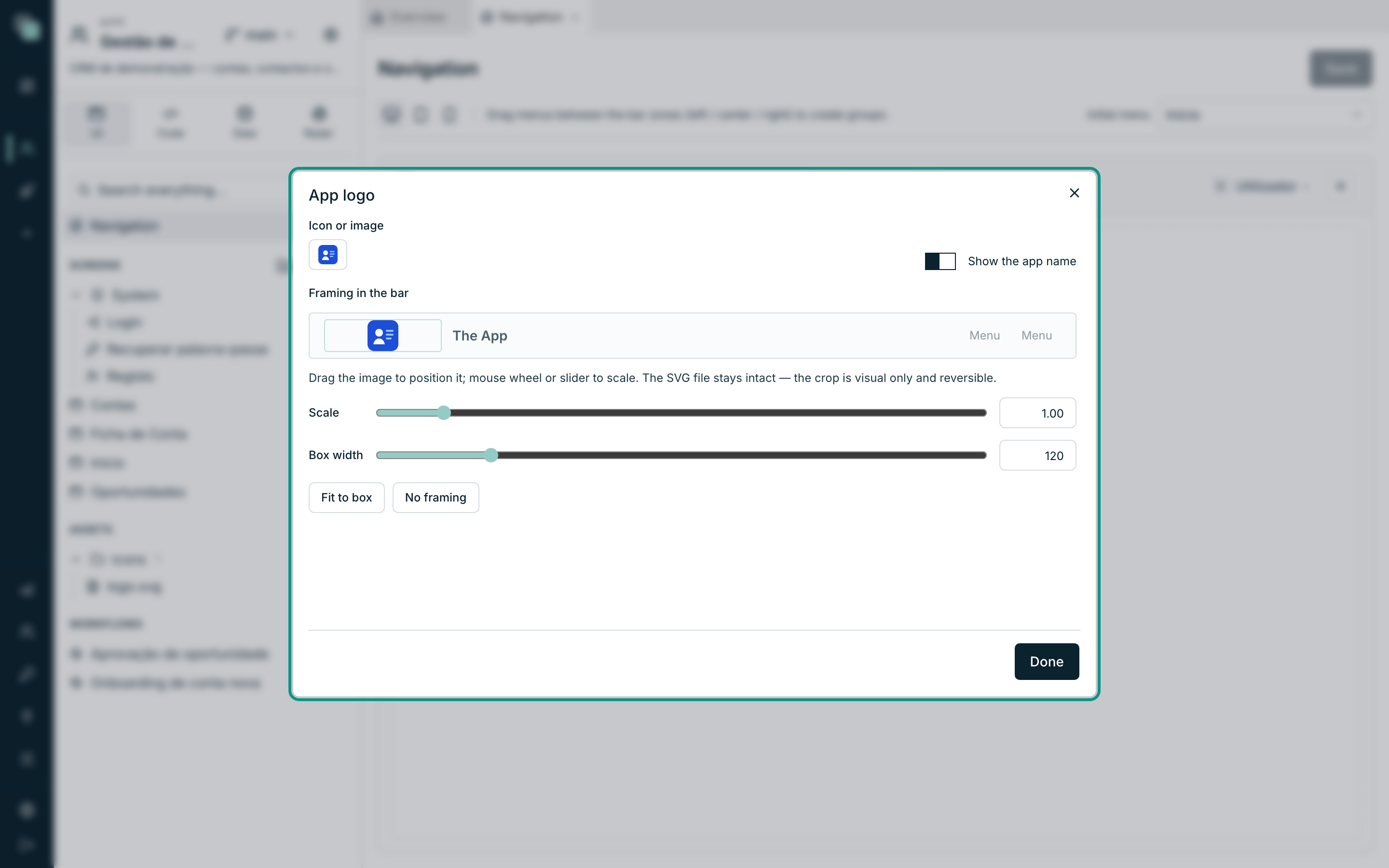
| Field | What it does |
|---|---|
| Icon or image | Choose an icon from the library or a file from the app's assets. |
| Show the app name | The name next to the brand. |
| Framing in the bar | For images from the assets (SVG, PNG, JPG, GIF or WebP): Scale, Box width, Box height and the positioning by dragging the image. |
| Fit to box | Resets scale and position. |
| No framing | Switches the framing off. |
Framing is the answer to the logo that "does not fit": you drag and scale until it sits well in the bar, and the dialog itself guarantees that the file stays intact — the crop is only visual and reversible. The box is 32 pixels high by default, in a 48-pixel bar: a horizontal logo only grows if you raise the Box height (up to 44); the Box width alone leaves empty space around a small logo. Without framing, the image sits in a 24-pixel box.
The preview strip in the dialog uses the real colours of the app's bar. If the bar is dark, the logo file has to be the light (white) version of the brand — the colour logo made for a white background disappears over the bar.
The logo area can have a background colour different from the rest of the top bar: it is the Logo area background colour, in the Navigation group of the app's Theme settings. There is no separator between the logo area and the menus; when the two colours differ, the change of colour is the boundary. This applies to the top bar on web and tablet; in the compact bar and in the drawer the logo follows the bar's colour.
The logo area is never narrower than the brand: with a mini or collapsed sidebar, the top menus start after the brand, not over it.
The browser tab shows «Screen name · App name», and just «App name» on a screen without a name; on the sign-in page it shows «Sign in · App name».
Tip
The picker chooses, it does not upload. Upload the file first in the Assets section of the app tree; it then appears here, in the App assets (SVG) tab.
Initial menu
Initial menu, in the top right corner, decides where the app opens. You choose one of the menus (not a loose screen), and it is chosen per device — the phone can open on a different panel from the computer.
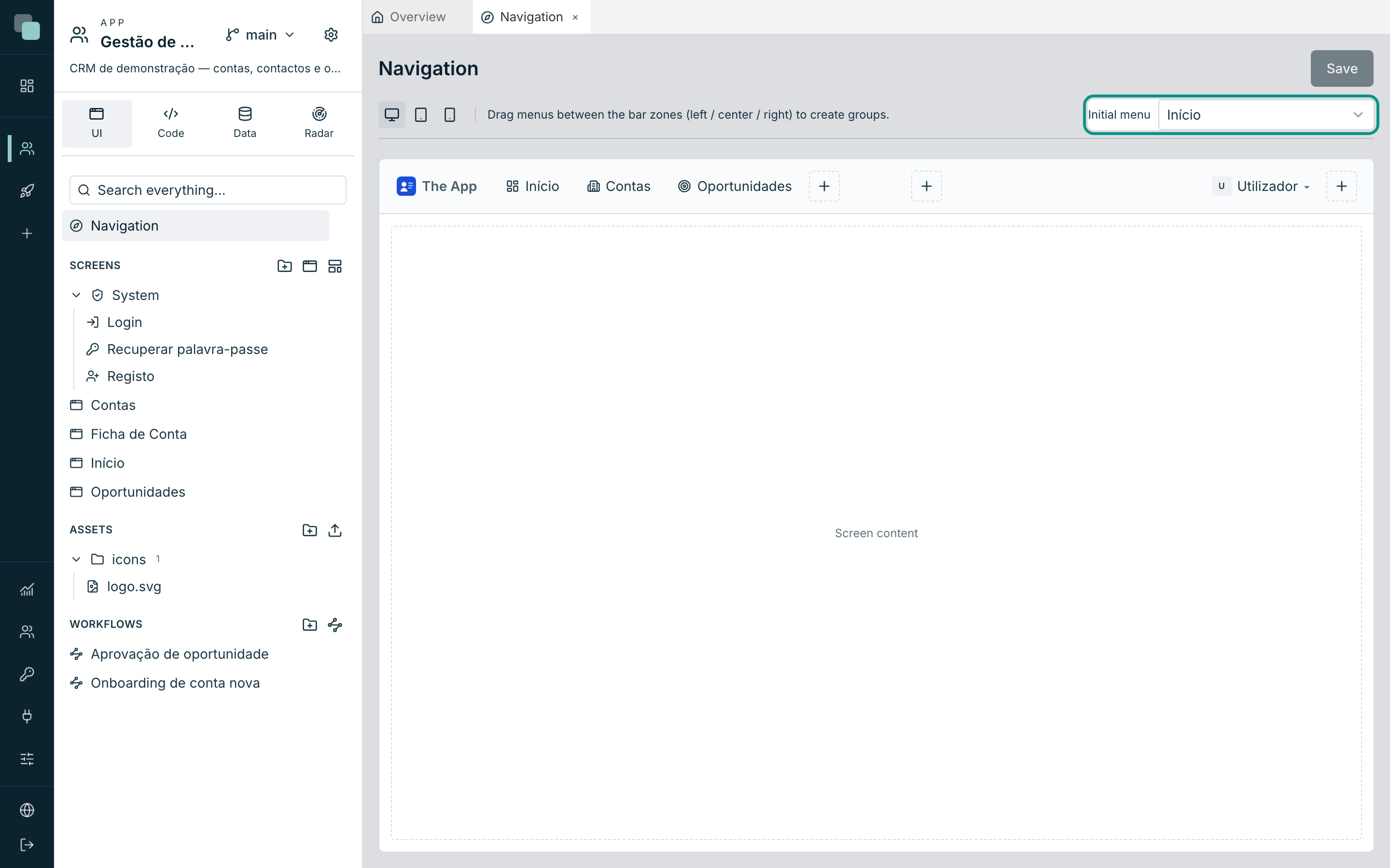
If a device has no choice of its own, it inherits the next one's (mobile → tablet → web); and if there is none at all, the app opens on the first menu that leads to a screen.
One design per device
Web is always a top bar. Tablet and mobile have a Mode selector:
| Mode | What it looks like |
|---|---|
| Top bar (tablet only) | Same as the computer: brand, menus and contexts in a bar. |
| Hamburger menu | A compact bar with the ☰ button, which opens the drawer with the menu tree. |
| Action bar | A bar at the bottom, mobile-app style, with up to 5 entries — and no drawer. |
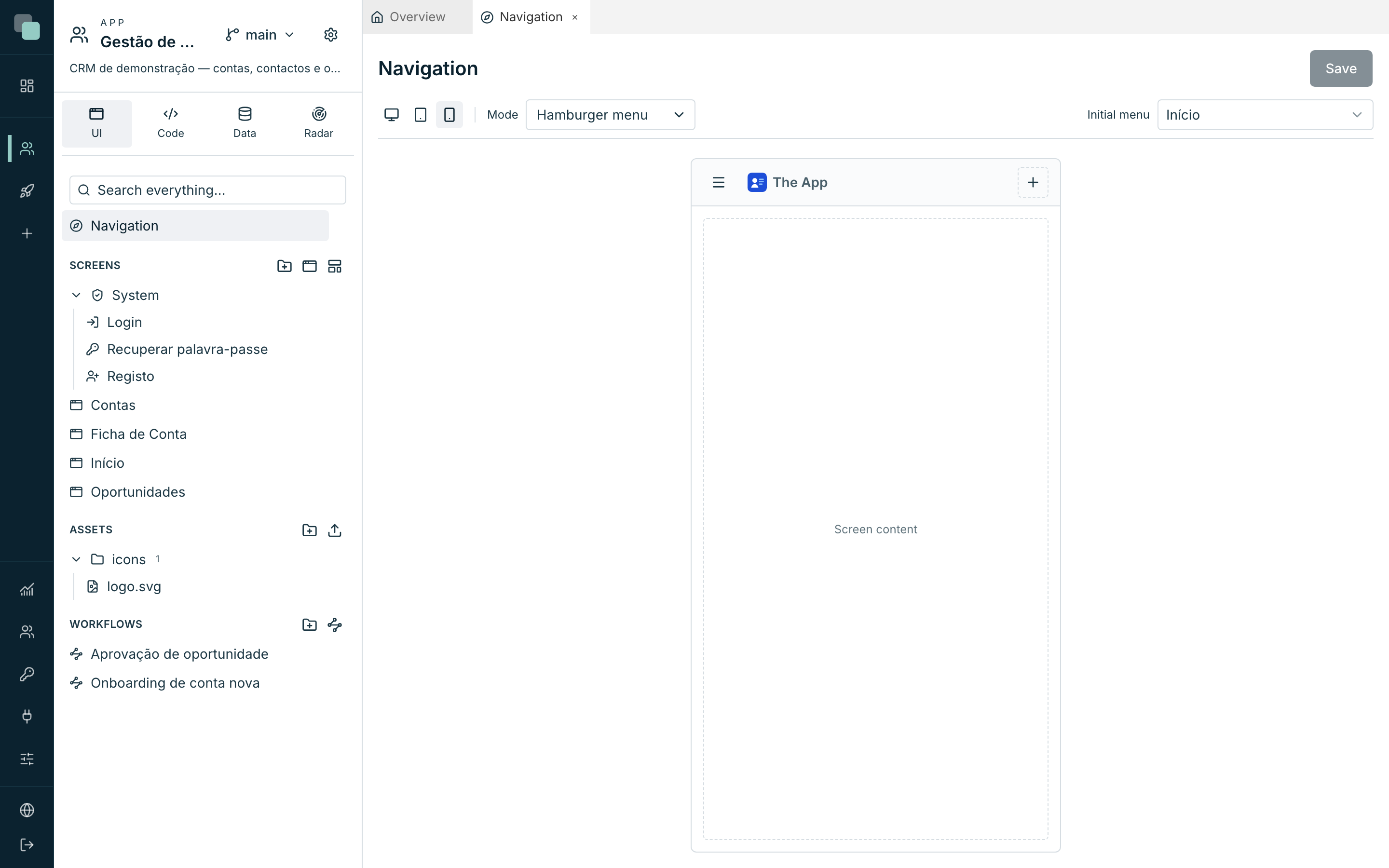
In the compact modes there are also two rows of their own:
- The Header — up to 4 actions next to the brand (the user menu and the bell live well here).
- The Action bar — up to 5 entries at the bottom, each one a Button or an Actions menu.
When the limit is reached, the platform says why: The action bar already has 5 items (max). / The header takes at most 4 actions.
Note
In the published app, the device is decided by the window width: below 640 px it is mobile, below 1024 px it is tablet, above it is web. A phone with no menus designed ends up with no navigation — design all three, or at least the ones the app is going to be used on.
Who sees what
The editor designs; who decides who sees each menu is App settings ▸ Permissions, in the Menus tab — per role and per device.
The rule is worth knowing: unlike screens, a menu is visible by default. The door is the screen, and that one is already shut; hiding the menu is for taking a whole group out of sight, or taking the bell away from someone who receives nothing. Hiding a group takes its children with it, and an item that points at an inaccessible screen disappears on its own.
Why doesn't…?
- Why did my changes disappear? They were not saved. The navigation has a Save button — and warns you before you close a tab with unsaved changes.
- Why can't I drop the menu where I want it? That spot does not accept that type. Invalid targets do not even light up: a context inside a context, a submenu inside a user menu, a separator in the top bar.
- Why don't I see the menus on the phone? The phone has a tree of its own and it may be empty. Choose Mobile (390px) and design it.
- Why did a menu disappear in the published app? Either it was hidden in Settings ▸ Permissions ▸ Menus for that role, or it points at a screen that person has no access to.
- Why does the logo come out cropped? It has framing on. Open the dialog and use Fit to box, or No framing.
- Why can't I change a menu's type? You don't. Delete it and create one with the right type — it is the only operation the platform does not let you do midway.
- Why does the pill always show 0? Switch on Hide when empty or zero, or confirm that the chosen API actually returns records.
- Why does the logo look small, with space around it? The box is 32 pixels high by default and a horizontal logo fits it with little width. Raise the Box height (up to 44) instead of the width.
- Why can't I see the logo in the bar? If the bar is dark and the file is the colour version for a white background, upload the white version of the brand to Assets and choose it in the dialog.
- Why doesn't my screen appear in Area screen? Only screens with the Bar (widget area) presentation appear. Change the Mode in the Presentation category of the screen's properties.
- Why doesn't the widget area appear in the sidebar? The bar is collapsed to icons, and the area does not fit there. Expand the bar.