Layouts and per-device design
Reusable templates behind the screens, and a separate design for web, tablet and mobile — no inheritance, with clear rules.
Two things on this page look alike and are not the same:
- A layout is a design shared by several screens — the header, the frame, the footer that repeat. It is made once and used everywhere.
- A device is a design of the same screen for another size — web, tablet, mobile. Each one is independent.
One is about reusing across screens; the other is about serving the same screen on displays of different sizes.
Layouts
A layout is a document like a screen — it has widgets and can have datastores — but with no route, no parameters and no access rules. You do not navigate to a layout: it is the background of whoever uses it.
Creating a layout
- In the sidebar, UI tab, Screens section.
- Click the New layout button, in the section header (or, in the ⋯ menu of a folder, to create it in there).
- Type the Layout name — the field suggests e.g. Base with header.
- Create.
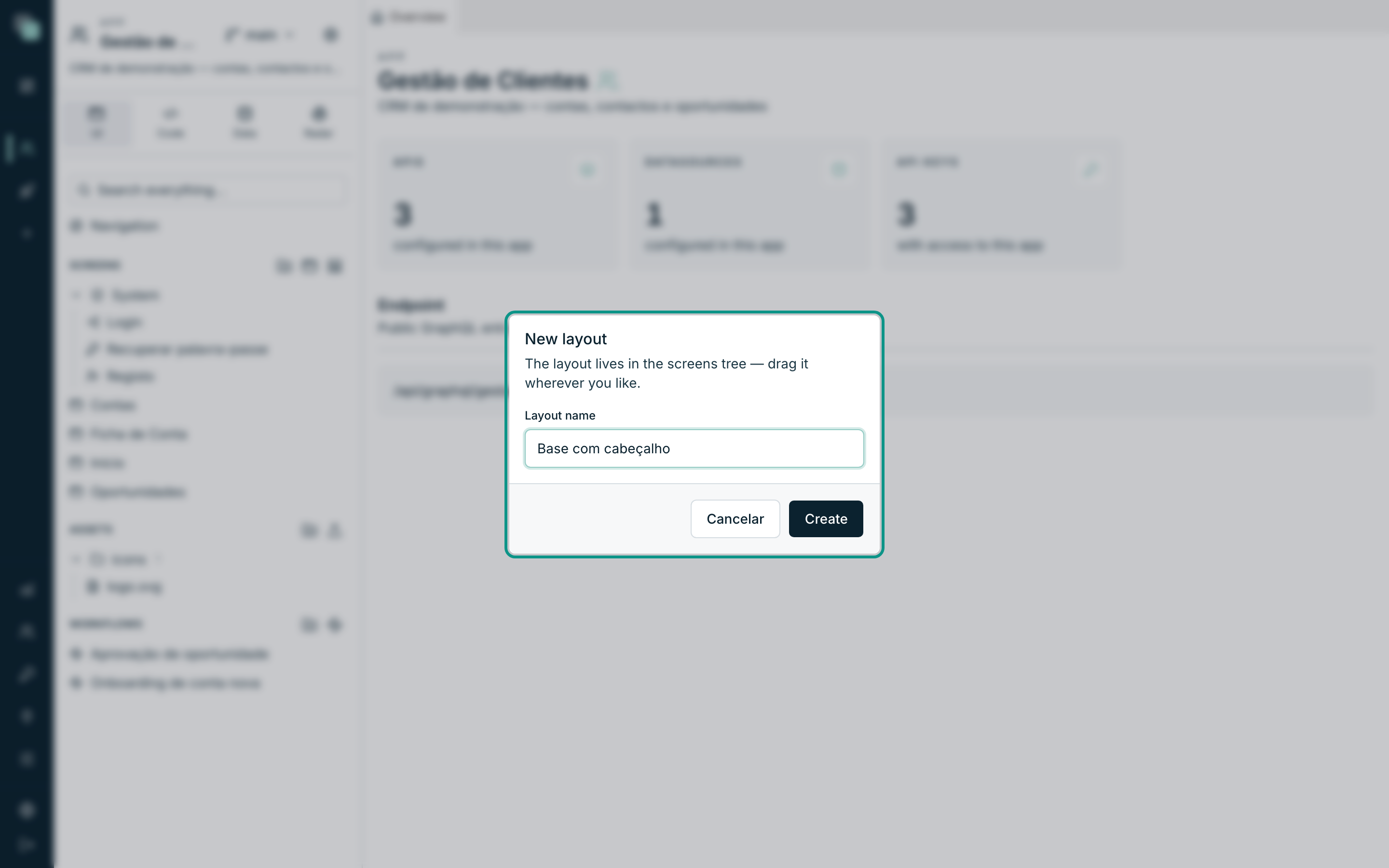
The layout sits in the same tree as the screens (the note says so: The layout lives in the screens tree — drag it wherever you like), with an icon of its own, and opens immediately in a tab.
Designing a layout
The editor is the same as the screens' — palette, canvas, inspector, the same gestures and the same shortcuts (see The canvas). The differences are of purpose:
| In the layout | Why |
|---|---|
The header badge shows /layout. |
A layout has no route. |
| There are no Route parameters, Presentation nor screen Events. | None of that belongs to the layout. |
| Instead of Screen template, the inspector has Base template, with the Base row. | A layout can rest on another. |
Note
A layout's widgets have no events. The layout is structure and looks; behavior belongs to each screen — and it is written there, even for the widgets that come from the layout.
Putting a layout on a screen
- Open the screen and click an empty area of the canvas (the inspector switches to showing the screen).
- Open the Screen template category.
- On the Layout row, choose the layout. To take it off, choose — no layout —.
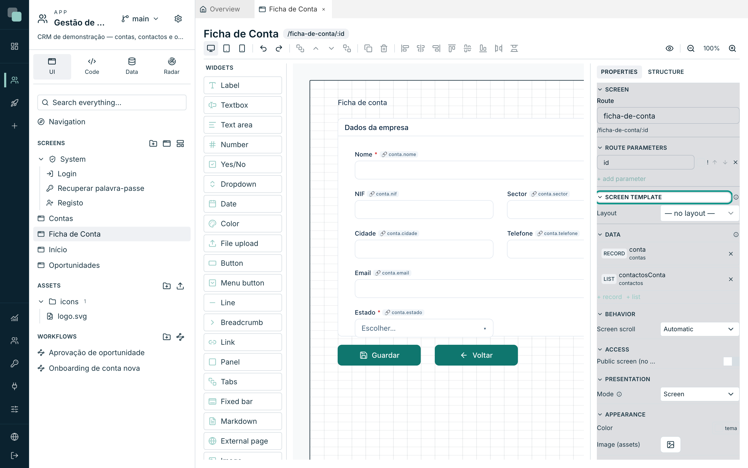
The category's hint sums up the contract: Template behind the content: layout widgets appear locked; properties and events are configured per screen.
What changes on the screen
The layout's widgets start appearing on the screen's canvas, behind its content, and with a padlock in the corner. What can and cannot be done with them is a fixed rule:
| On the screen, on a layout widget | |
|---|---|
| Move, resize, delete, duplicate | No. Position is edited in the layout itself. |
| Change properties (texts, colors, options) | Yes — and the change belongs to this screen only. |
| Visible / Enabled | Yes, per screen. |
| Events | Yes — behavior always belongs to the screen. |
| Access and Phrase values | No. They are defined in the layout. |
The inspector tells you which situation you are in: Layout widget: position is edited in the layout; properties, visibility and events belong to THIS screen.
No "content zones"
There are no slots nor reserved areas: the screen's content is always drawn on top of the layout. Whoever designs the layout is the one who leaves the free space where the screens will write — a header on top, a bar at the bottom, and the middle empty.
Tip
Design the layout with an empty core and a generous margin. A layout that takes up the center forces every screen to steer around it forever.
Collisions and chains
Two rules the platform checks and refuses to break:
- Unique ids and names. A screen and its layout cannot have the same widget id nor the same datastore name — Layout collision: widget id "…" exists in both. There are no automatic prefixes: the name you chose is the name that stays.
- At most 3 levels, and no loops. A layout can rest on another (Base template), but the chain stops at three — The layout chain exceeds 3 levels. — and a cycle is refused.
When the layout changes
The screen stores only which layout it is and the changes it made to its widgets. The design is not copied — so changing the layout changes every screen that uses it, on the spot, in the published app.
Two practical consequences:
- In the builder, a screen tab that was already open does not refresh itself when you save the layout: close and reopen the screen to see it with the new version.
- Deleting a layout in use is not prevented. The screens that used it start opening without it, with the warning The associated layout no longer exists. — they do not break, but they lose the frame.
Per-device design
A screen has three possible designs, one per device:
| Device | Reference width |
|---|---|
| Web (1280px) | Computer. |
| Tablet (768px) | Tablet, and narrow windows. |
| Mobile (390px) | Phone. |
They are switched with the three buttons on the left of the designer's bar.
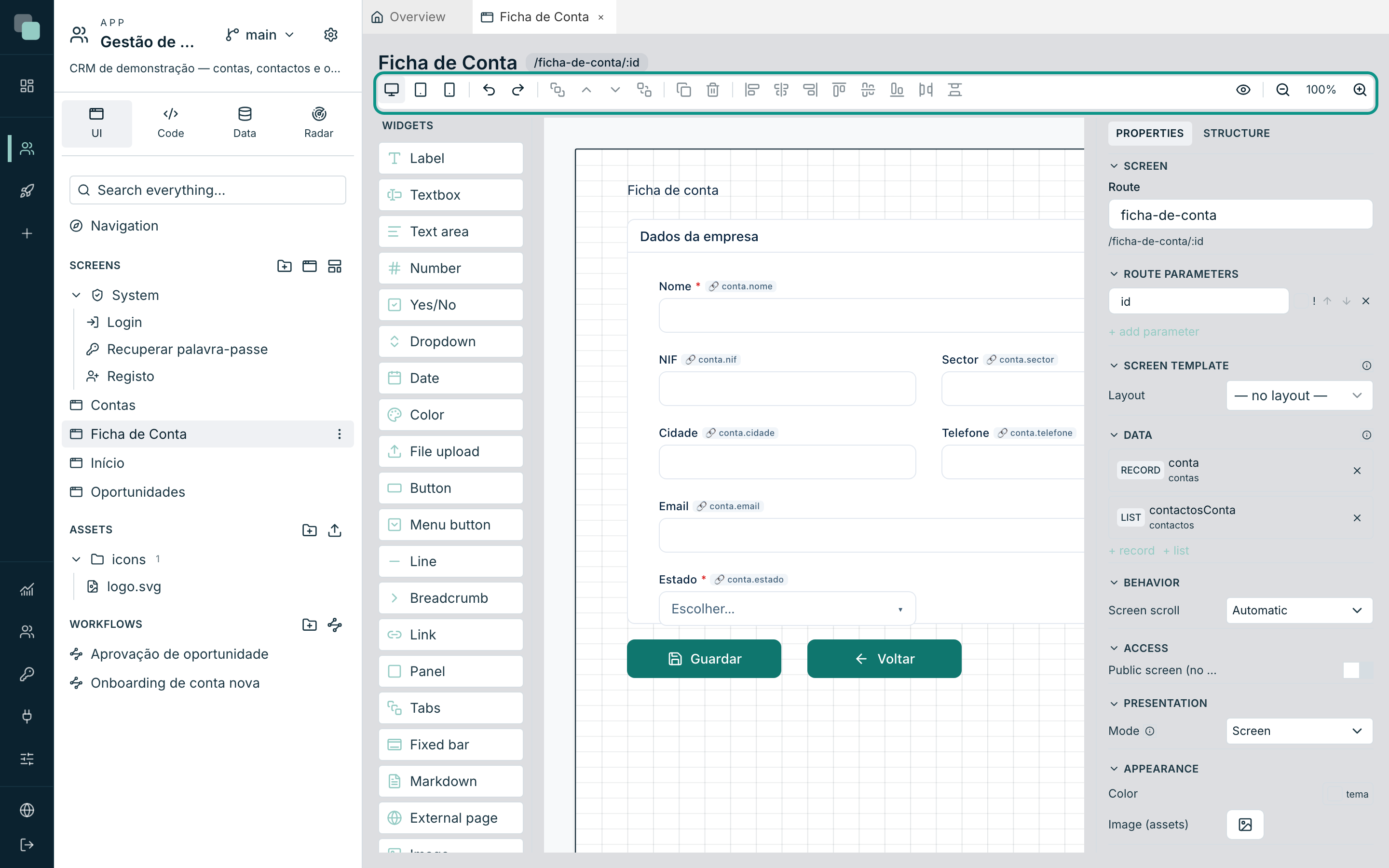
The grid is the same in all three — 48 columns — and what changes is the width of each column. A widget 24 columns wide takes up half the page on any device; the height, though, is always counted in pixels.
There is no inheritance
This is the rule that explains everything else: each device has its own widget tree, complete and independent. There is no "hide on web and show on mobile" across trees — what is not in a device's tree does not exist on that device.
Web always exists. Tablet and mobile may be yet to design — and in that case the app serves the web design, squeezed to the real width. It is a fallback for serving, not inheritance: they go on being separate designs at editing time.
Starting a device's design
Choose Tablet (768px) or Mobile (390px) on a screen that does not have them yet and the designer shows the card This device has no design yet, with the explanation — Each device has its own design. Until this one exists, the runtime serves the web design. — and two paths:
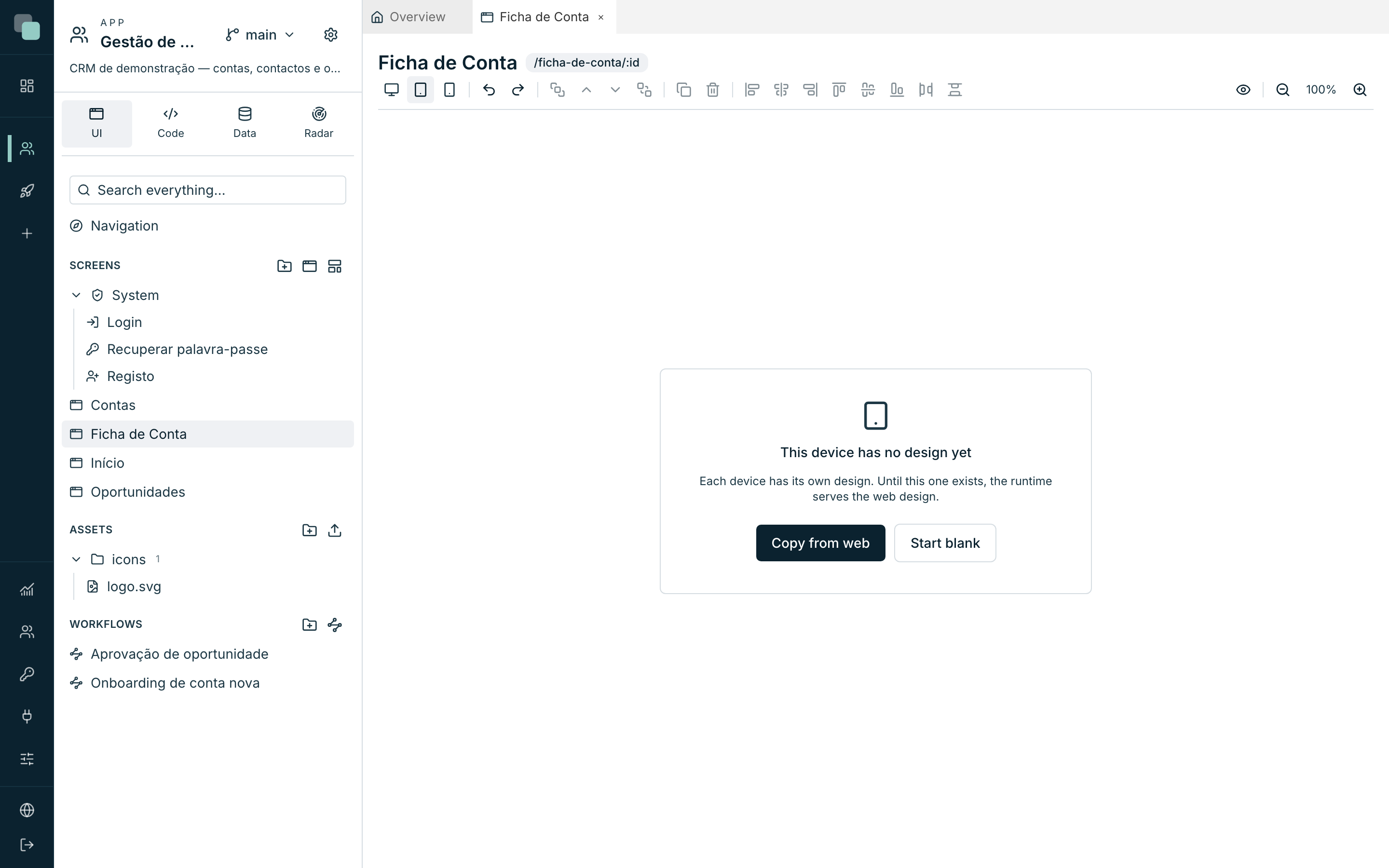
| Button | What it does |
|---|---|
| Copy from web | Duplicates the web design as a starting point. Widget ids are kept (the data bindings and the code still find them) and widths readjust because they are in columns. |
| Start blank | A blank sheet, to design from scratch. |
The copy happens once. From then on the designs lead separate lives: touching web does not touch mobile.
Warning
While the device has a design, the bar shows Delete this device's design. The confirmation is clear — This device's design disappears and the runtime goes back to serving web. There is no undo. — and it means it: there is no Undo for this operation.
Hiding widgets on this device
Inside a device, the inspector's Structure tab has an eye on each widget: Hide on this device / Show on this device. A hidden widget stays in the tree and stays editable from the Structure — it just does not come out on the screen.
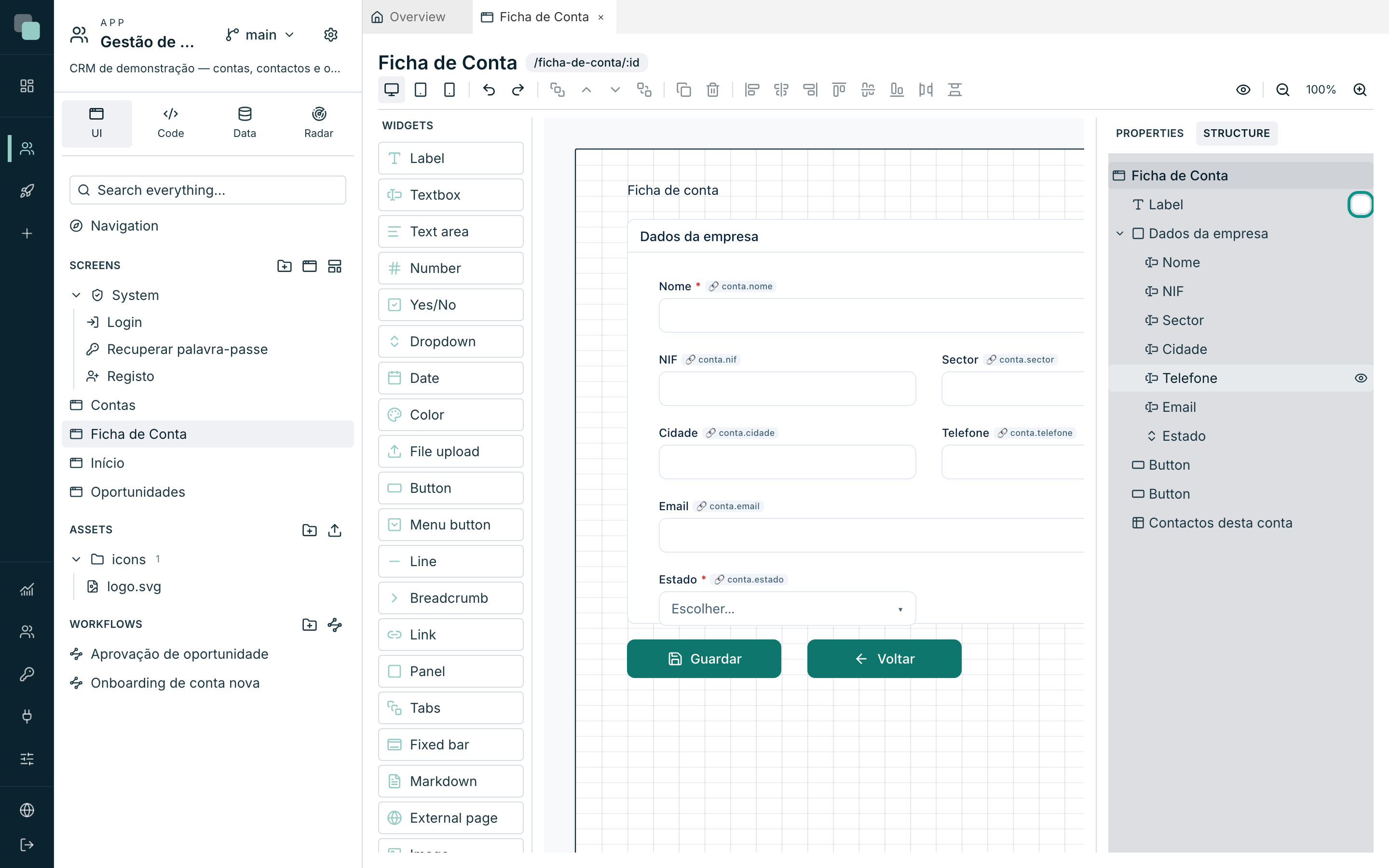
If what is hidden is the container, the children go with it — and their eye explains it: Hidden by a parent container.
The page height
Height is per device: a phone can have a much taller page than web for the same screen. Drag the bottom edge of the canvas (Page height — drag to adjust) to change it.
When the page is taller than the device, the canvas draws a dashed line with the viewport bottom label — that is where what is seen without scrolling ends. Everything below that line only appears to whoever scrolls the page.
What the app serves
In the published app, the device is chosen by the window width: below 640 px it is mobile, below 1024 px it is tablet, above that it is web. Resizing the window changes the design served, right there.
With no design for the detected device, web is served. In the native mobile app, that fallback is announced — This screen has no mobile design — showing the web design.
The Preview button opens the screen in the real app; to see how it looks at another size, change the size of the browser window.
Events, ids and devices
As each device is a tree, the same widget id can exist in all three — it
is on purpose, it is "the same logical widget at another size". But each one
has its own properties and its own code: changing the button's onClick
on web does not change the phone's.
When writing code (see
Events and the SDK), remember
that keplin.widgets.get("...") only finds widgets of the device that is
running. A widget that only exists on web errors on the phone.
Layouts and devices, together
The two things combine by the same rule: the layout is composed per device. A layout designed only for web also appears in the tablet and mobile trees of the screens that use it, serving its own web design — and a layout with a design of its own for mobile serves that one.
Note
The app's navigation bar does not come from the layout: it is designed in the Navigation editor and the app draws it around the screen. A layout can have a bar of its own — but that one is screen content and does not know how to navigate by itself.
How to decide
| Situation | The path |
|---|---|
| The same header on 20 screens. | A layout. |
| A complex screen that has to be something else on the phone. | A mobile design of its own. |
| A button that makes no sense on the phone. | The Structure eye on the mobile device. |
| A different menu on the phone. | The Navigation editor, on the mobile device. |
| An app that is only ever used on the computer. | Design web only and think no more about it. |
Why doesn't…?
- Why can't I touch this widget? It has a padlock: it comes from the layout. Open the layout and change it there — on the screen you only change properties, visibility and events.
- Why won't it let me choose the layout? There is a collision: the screen and the layout have the same widget id or the same datastore name. Rename one of the two.
- Why doesn't the screen show the changes I made to the layout? The screen's tab was open. Close and reopen.
- Why does the phone show the web design all squeezed? That screen has no mobile design. Choose Mobile (390px) and use Copy from web or Start blank.
- Why did I change web and mobile did not change? Because they are independent designs. The copy only happens at the moment you create the device.
- Why did the frame disappear from every screen? The layout was deleted. The screens warn The associated layout no longer exists. — create it again and choose it again in Screen template.