Navigation and theme
Building the app's menu, placing the logo, painting the application with the brand's colors and preparing the languages.
The four screens exist, but anyone entering the app has no way of reaching them: the navigation is missing. This stage is short and changes everything — by the end, the app has a menu, a logo, colors of its own and is ready to speak more than one language.
Three different things, three different places:
| What | Where it is done |
|---|---|
| The navigation — the menu you move around the app with | UI panel ▸ Navigation |
| The theme — colors, corners and typography | App settings ▸ Theme |
| The languages — the languages and the phrases | App settings ▸ Translations |
The navigation editor
- In the UI panel, click Navigation, right above the Screens section. A tab opens with the editor.
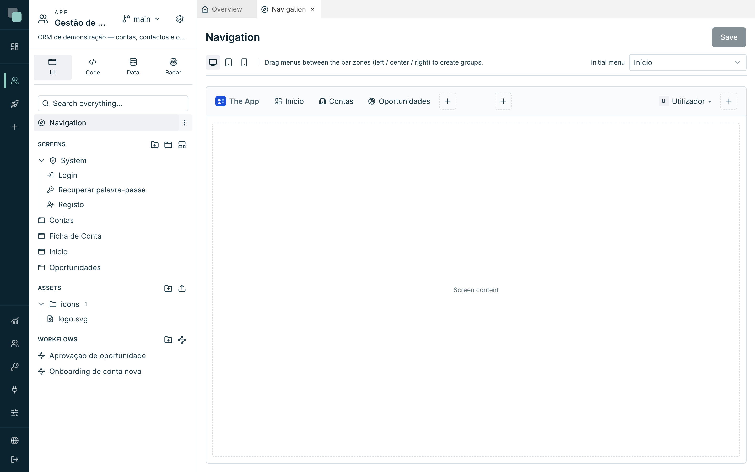
- The editor is a mock-up of the app's bar: you drag menus between the zones (left, center, right) and see the result on the spot.
- The three device buttons at the top — Web (1280px), Tablet (768px), Mobile (390px) — switch designs. Start on Web.
Creating the three menus
- Click the + of the left zone. A new item appears, along with the Selected item panel on the right.
- Choose Menu — the type that leads to a screen.
- Fill in Menu label, choose the Icon and, in Screen, the destination screen.
- Repeat for all three.
| Menu label | Icon | Screen |
|---|---|---|
Início |
layout-dashboard |
Início |
Contas |
building-2 |
Contas |
Oportunidades |
target |
Oportunidades |
Notice what is not on the list: the Ficha de Conta. It is on purpose — you get there by clicking a row of the accounts table, not through a menu. A screen without a menu remains reachable by route and by code; the navigation is only the front door.
- In the top right corner, choose the Initial menu:
Início. It is the screen that opens when someone enters the app without giving any route. - Click Save — "Navigation saved."
Tip
The item types are not all "leads to a screen". There is Submenu (groups items), Context (sidebar) (turns on a sidebar of its own inside the app), Separator (a divider) and Notifications (the bell, with the unread count). For a four-screen CRM, three simple menus are enough.
The user menu
On the right-hand side of the bar there is a special item: the User menu. It is where whoever uses the app sees their name and signs out. Select it and fine-tune:
- Show name and Show username (login) — what appears next to the avatar. Without an icon, the avatar shows the initials of the name.
- "Sign out" option — leave System default (translated), unless you want other text.
The app's logo
The logo lives in the bar, to the left of everything. Before choosing it, it has to be uploaded to the app:
- In the UI panel, in the Assets section, click Upload files and choose your logo. An SVG is the best choice: it stays sharp at any size and is the only format that allows framing.
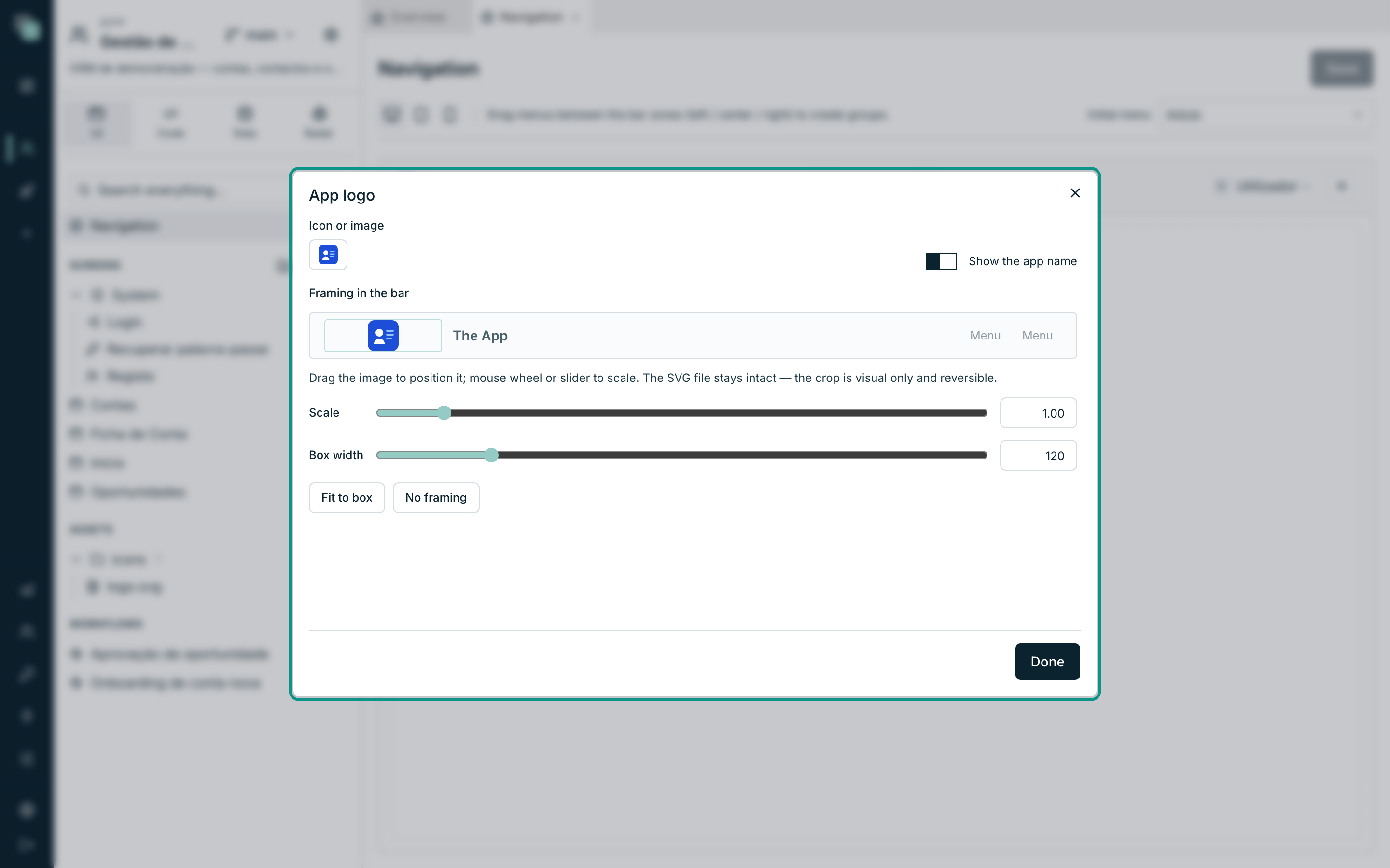
- Go back to the Navigation tab and click the logo on the mock-up (Edit the app logo).
- In Icon or image, choose the file you uploaded.
- Turn on Show the app name if you want the name written next to the symbol.
- In Framing in the bar, drag the image to position it and use the Scale and the Box width to size it — "The SVG file stays intact — the crop is visual only and reversible." Fit to box does the work for you; No framing goes back to the start.
- Close with Done and Save.
Each device has its own navigation
Go back to the top of the editor and click Mobile (390px). Notice that the design is another one — and that a new selector appears, Mode:
| Mode | What it gives you |
|---|---|
| Top bar | The same bar as the web, shrunk. |
| Hamburger menu | A button that opens the menu in a side panel. It is the most common on a phone. |
| Action bar | A bar at the bottom of the screen, with up to 5 items — the pattern of mobile apps. |
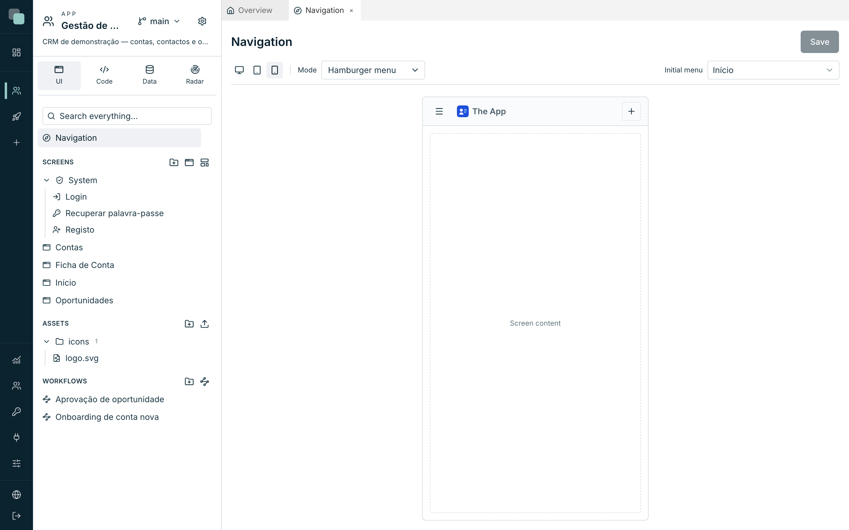
Set up on Mobile the same three menus (Início, Contas, Oportunidades), choose the Mode you prefer and save. The Initial menu is also per device — you can open the dashboard on the computer and the list of accounts on the phone.
Note
One device's navigation does not inherit another's, just as happens with the screens' design. It is extra work, and it is on purpose: the menu that makes sense on a 27-inch display is rarely the one that makes sense on a phone.
The theme — painting the app
The Theme paints the built app, without touching any screen.
- At the top of the app's bar, click the gear icon (App settings).
- In the Appearance group, choose Theme.
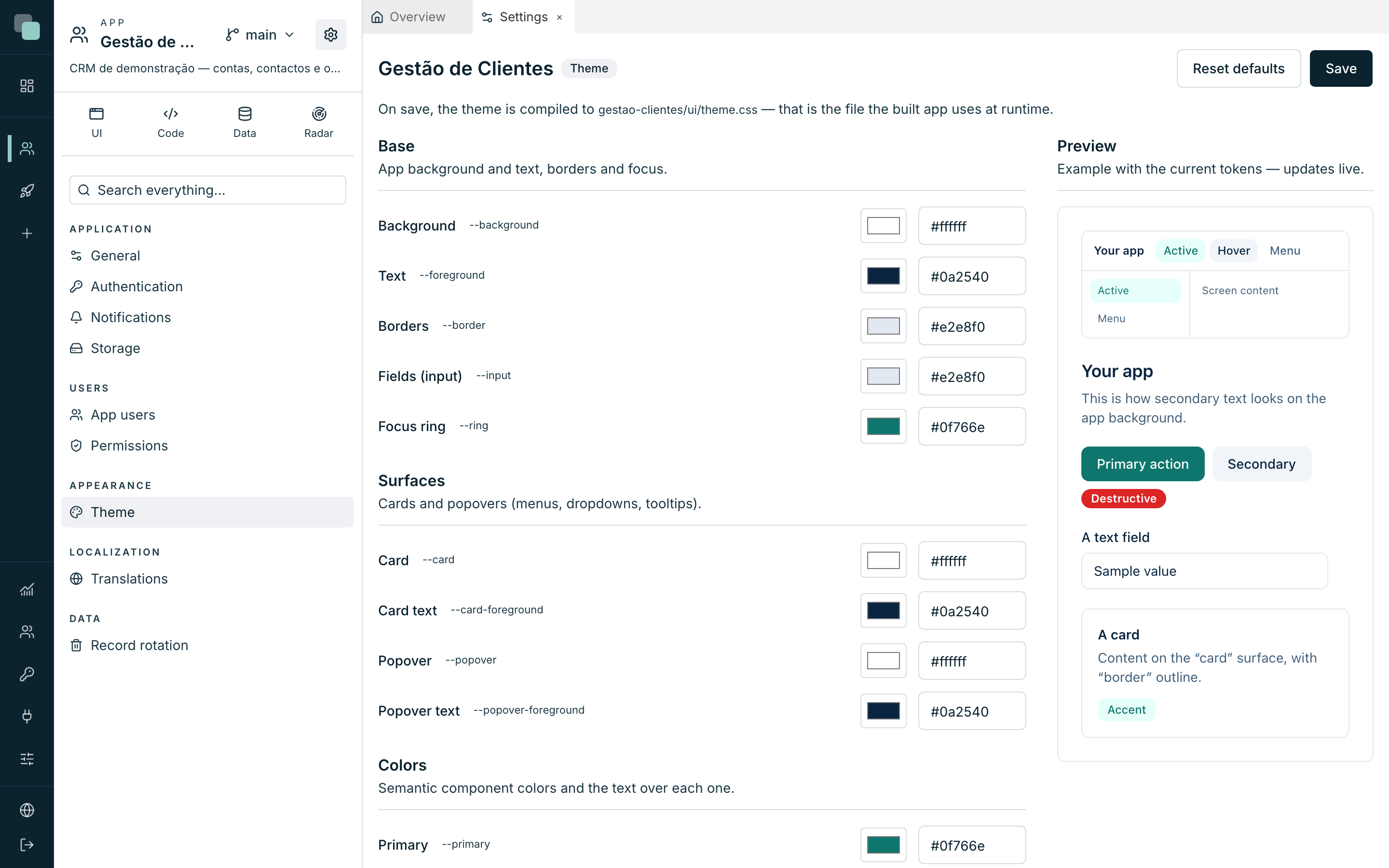
- On the left sit the color groups; on the right, the Preview panel — "Example with the current tokens — updates live". Every color you change shows up there in the instant.
| Group | What it paints |
|---|---|
| Base | The app's background and text, borders, fields and the focus ring. |
| Surfaces | Cards and popovers (menus, dropdowns, tooltips). |
| Colors | The semantic colors — Primary, Secondary, Destructive, Accent, Muted — and the text over each one. |
| Navigation | The app's navigation bars. By default they follow the surfaces; this is where the branding is applied. |
For the Customer Management app it is enough to touch two things:
- In Colors, set the Primary to your brand's color. It is the color of the action buttons, of the links and of the active state.
- In Navigation, decide whether the bar stays light (following the surfaces, which is the default) or takes on the brand color. If you paint it, adjust the Bar text too — a dark bar with dark text cannot be read.
Each color has a visual picker and a hexadecimal field (#rrggbb) —
typing or picking comes to the same. At the end of the list, Shape and
typography:
- Corner radius — from No rounding (0) to Maximum (1rem), in five steps.
- Notice position — which corner the notices appear in (the ones that
the
keplin.ui.toast()of the previous stage shows). - Font (sans) — the app's font stack.
Save with Save. To go back to the original colors, Reset defaults — it resets in the editor, and only becomes final when you save.
Tip
On the screens, prefer the theme's tokens over hand-written colors. A
widget with the color #0f766e keeps that color forever; a widget with
the primary color token follows the theme when the brand changes.
The languages
The last piece of this stage is the Translations section, in the Localization group of the settings. It is a matrix: one row per phrase, one column per language.
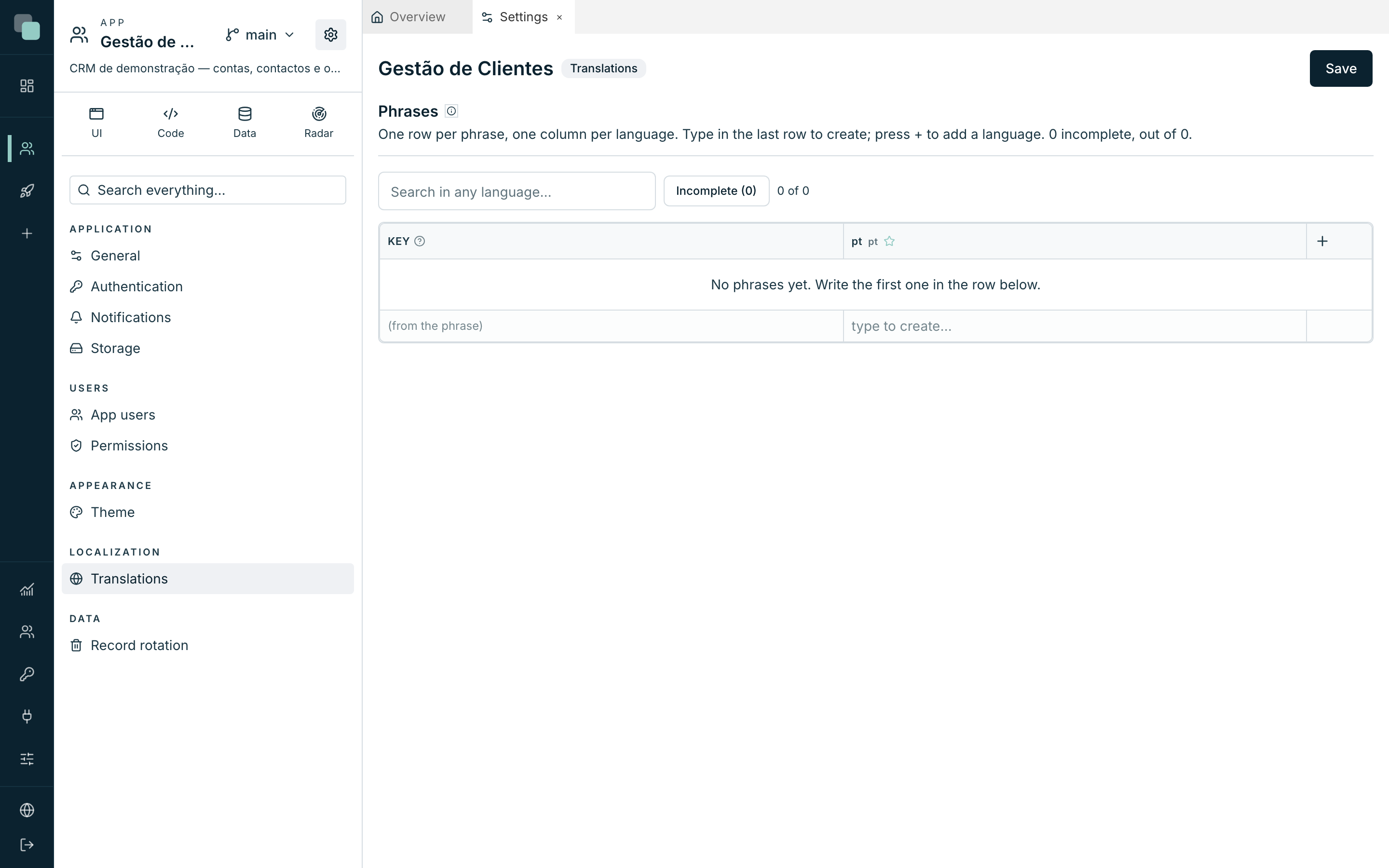
In a freshly built app it is empty, and that is normal: the texts you typed on the widgets live in the screens. The translations are for the texts that the code writes — and to give the app a second language.
Adding a language:
- Click the + in the matrix's header.
- Choose the language in pick a language… and confirm with Add language. The new column is born empty.
Creating a phrase:
- Type on the last row, which is always waiting ("type to create…").
- The phrase's Key "(comes from the phrase)" — it is the text itself in the base language that identifies it.
- Fill in the other columns with the translation.
In the screens' events, the phrase is used by its text:
keplin.ui.toast(keplin.i18n.t("Account saved"));
To put a value in the middle of a phrase, write it between braces:
{n} accounts gives 3 accounts, and the value comes in through the code
— keplin.i18n.t("{n} accounts", { n: 3 }). A yellow cell warns you that
that translation lost a brace the original has: in that language the value
would not appear.
At the end, Save — "Translations saved and compiled."
Note
Changing the text of a phrase that is already saved means changing its key — and the platform swaps it in the screens that use it too, saying how many it touched. Nothing is left pointing at a phrase that no longer exists.
Why doesn't…?
- Why doesn't my screen appear in the menu's list of screens? The Screen selector lists the app's normal screens. System screens (login, recovery, registration) do not go into menus — the platform serves them by itself.
- Why does the app keep opening on the wrong screen? The Initial menu is per device. Confirm it on the device you are testing on.
- Why does my logo appear cropped? Use Fit to box or increase the Box width. And remember: the framing is only available for SVG files.
- Why hasn't the theme changed in the app? You missed Save — the Preview updates live, but the built app only receives the theme when you save.
- Why did a widget ignore the new color? It has a hand-written color in the Appearance category. Swap it for a theme token.
The app is assembled and painted. Next stage: logic and automation.