The canvas
The visual screen editor — grid, moving and resizing, smart guides, aligning, layers, anchors, undo and the inspector.
An app's screens are drawn in a visual editor: you drag widgets from a palette onto a canvas, position them to the pixel with the help of a grid and smart guides, and fine-tune every detail in an inspector on the right. This page explains that working environment — everything that comes after (widgets, data, events) happens inside it.
The examples are from the Customer Management app: a CRM with screens for accounts, opportunities and dashboards.
Opening and creating screens
Screens live in the app's sidebar, on the UI tab, inside the Screens section. Clicking a screen opens it in a workspace tab — you can have several screens open side by side, and each tab remembers what it was doing.
To create a screen:
- Open the app and choose the UI tab in the sidebar.
- In the Screens section, click the New screen button.
- Give it a name — for example, Ficha de Cliente — and confirm with Create.
- The screen opens immediately in the workspace, ready to draw.
The same section has folders (New folder) to organise the tree, the System screens (login, password recovery and sign-up — with fixed routes and parameters) and the layouts — reusable templates left for the chapter Layouts and per-device design.
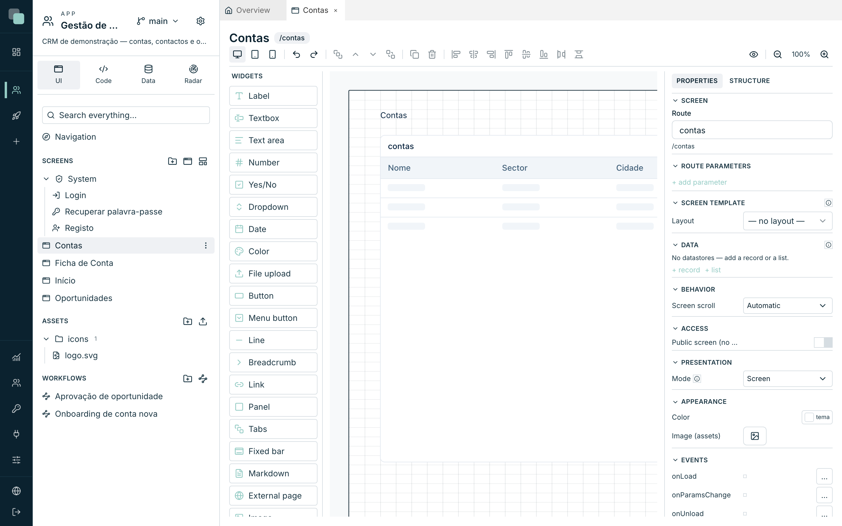
The three zones of the designer
| Zone | What it is |
|---|---|
| Widgets (left) | The widget catalogue. Drag any of them onto the canvas — the hint on the item itself tells you: Drag onto the canvas. |
| Canvas (centre) | The screen's page, drawn at the real scale of the active device, with the app's theme already applied. What you see is what the app shows. |
| Inspector (right) | The properties of what is selected — or of the screen itself, when nothing is. It has two tabs: Properties and Structure. |
Above the canvas sits the toolbar: the three devices (Web (1280px), Tablet (768px), Mobile (390px)), undo/redo, layers, duplicate, delete, align/distribute, Preview and the zoom (Zoom in, Zoom out, and the clickable percentage to Reset to 100%).
Note
Each device has its own, independent drawing — there is no inheritance between them. The why and the how are in Layouts and per-device design.
The Widgets palette groups the catalogue by type (Containers, Editors, Actions and navigation, Content and Data, plus Custom when the app has widgets of its own); each group collapses with a click on its title, and the Search box at the top filters by name, ignoring case and accents. The palette's width is dragged from its right edge and remembered; double-click the handle to restore the default. The palette, the toolbar and the header are the same in the workflow and report designers.
The grid
The canvas rests on a grid that keeps screens tidy without tying you down:
- Horizontally, the page divides into 48 columns. A widget's position and width are counted in columns — that is what makes a screen drawn for web stay proportional in a narrower modal.
- Vertically, snapping is in steps of 8 pixels; position and height are stored to the pixel.
While dragging, the widget snaps to the nearest column and vertical step. If you need to drop it exactly where the mouse is, hold the Alt key during the drag — snapping stays off while it is pressed.
The same values can be typed by hand: with a widget selected, the Layout category of the inspector shows Col, Span (in columns), Y and H (in pixels).
The gutter is set for web and scales with the device width: 16 px on web (1280 px) become 10 px on tablet and 5 px on mobile, so the space between widgets stays proportional on small screens. That is why two widgets in adjacent columns are always the right distance apart, whatever the device.
Selecting, moving, resizing
- Click selects a widget; Shift+click adds to or removes from the selection; dragging from an empty area draws a selection box that catches everything it touches.
- Drag a widget to move it; pull the corner and edge handles to resize it.
- The keyboard arrows move the selection: ←/→ one column, ↑/↓ one pixel — and Shift+↑/↓ eight pixels at a time.
- Dropping a widget inside a Panel, a Tabs or a Fixed bar makes it a child of that container: it now moves with it and the position becomes relative to the container.
Smart guides
While you drag or resize, the canvas compares the moving widget with its neighbours and suggests snaps — the guides are drawn on the spot:
| Guide | When it appears |
|---|---|
| Alignment | An edge or the centre of the widget lines up with a neighbour's edge/centre — the widget snaps to that line. |
| Equal spacing | You are dropping the widget at the same distance two neighbours already are from each other — the row ends up with even gaps. |
| Equal size | While resizing, the width or height becomes equal to a neighbour's — it snaps to that size. |
Alignment beats spacing, and spacing beats the grid: when you are visibly trying to butt up against an edge, that is what happens.
Aligning and distributing
With two or more widgets selected, the toolbar enables the alignment buttons: Align left, Center horizontally, Align right, Align top, Center vertically and Align bottom. With three or more, Distribute horizontally and Distribute vertically join in, evening out the gaps while keeping the first and the last in place.
With several widgets selected the inspector sums up: N widgets selected — use the toolbar to align/distribute.
Layers
Widgets can overlap — a Label on top of an Image, for example. The order is controlled from the toolbar: Bring to front, Bring forward, Send backward and Send to back.
Anchors — tying to the margins
By default, a widget stays where you put it down. Anchors tie the widget's edges to the page's margins (or to those of the container it is in): select a widget and click the pins that appear halfway along each edge — Anchor to top, Anchor to left, Anchor to right, Anchor to bottom.
- Anchoring left + right makes the widget stretch with the page's width — the classic full-width header.
- Anchoring to the bottom glues the widget to the bottom of the page — a button bar that stays down there, whatever height the page has.
The page height
A screen's page has a fixed height per device — it never grows on its own with the content. The bottom edge of the canvas is a handle: drag it to adjust (Page height — drag to adjust). Below the content, the screen's background carries on to the end (the background continues to the bottom of the screen). If the content overruns the height, the user scrolls — unless you turn that off (see the screen's properties).
Undo, redo and the shortcuts
Every gesture — dropping, moving, resizing, changing a property, deleting — is a step of history. Undo (Ctrl+Z) and Redo (Ctrl+Shift+Z) are on the toolbar; consecutive keyboard moves merge into a single step, so undo does not have to walk back key by key.
| Shortcut | Action |
|---|---|
| Ctrl+Z / Ctrl+Shift+Z (or Ctrl+Y) | Undo / Redo |
| Ctrl+C / Ctrl+X / Ctrl+V | Copy / Cut / Paste (the copy lands shifted one column) |
| Ctrl+D | Duplicate the selection |
| Ctrl+A | Select every widget of the active device |
| Delete or Backspace | Delete the selection |
| Escape | Clear the selection |
| Arrows / Shift+↑↓ | Move the selection (column by column; 1 px; 8 px) |
| Ctrl+mouse wheel | Zoom |
On a Mac, use ⌘ where it says Ctrl.
Note
Deleting a container deletes what is inside it; deleting a Table also deletes the action buttons linked to it. A single Undo puts everything back.
Autosave and preview
There is no save button: changes save themselves. The top right corner says where they stand — Saving…, Saved, or Save failed — try again if something went wrong (just touch it again to retry).
The Preview button saves whatever is pending and opens the screen in the real app, in a new browser tab — you go through the login like any user and see the screen working with real data.
The inspector
The inspector has two tabs:
- Properties — everything that is editable on what is selected.
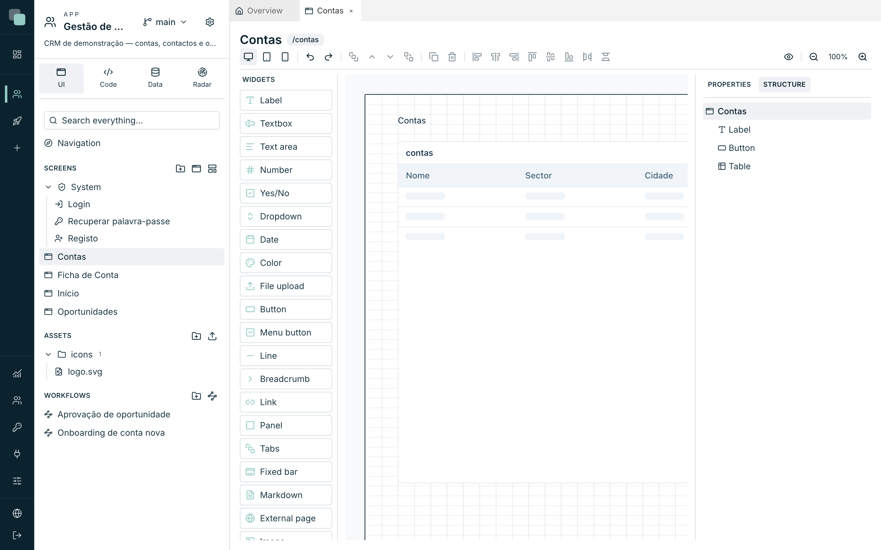
- Structure — the widget tree of the active device.
A widget's properties
With a widget selected, the top of the inspector shows the widget's type and id (in monospaced type) — it is this id you use in the events' code. The properties are organised into categories; each widget only shows the ones that concern it:
| Category | What it holds |
|---|---|
| Layout | Col, Span, Y, H, and the Visible and Enabled switches (a disabled widget goes grey and loses interaction, keyboard included). |
| Access | Requires action — an action declared in Settings ▸ Permissions; whoever does not have it does not use the widget. In Without the action you choose Hide or Show disabled. |
| Content | Texts, labels, icons — and the Phrase values (see below). |
| Data | The widget's data binding (see Datastores and data). |
| Behavior | Operating options — views, drags, click actions. |
| Validation | On form fields: Required, standard rules and script (see Widgets). |
| Interaction | Click actions of widgets like the Button. |
| Appearance | Visual style (see below). |
| Events | The widget's events (see Events and the SDK). |
Some widgets have editable inner elements — a Table column, a List field, a tab of the Tabs. Click the element directly on the canvas to edit it; the inspector switches to that element and the back to widget button brings you back.
Appearance
The Appearance category is the same on (almost) every widget: Background, Border with Border stroke (Solid, Dashed, Dotted), radius, padding, Shadow (No shadow, Soft, Medium, Strong, Extra), and the Text options — colour, Size, Weight, Text align. The colours accept the app theme's tokens or hex values — use the tokens whenever possible, so the widget follows the theme.
The radius (px) is the widget's corner radius, in pixels, and it overrides the theme radius across the whole widget: the frame and the elements inside it (an input's field, a table's cells, a list's cards). Empty uses the theme radius; zero means square corners. Widgets inside a container with its own radius keep the theme radius unless they have their own. Lists that open on top (a dropdown's options, the picker window) keep the theme radius. KeplinGo follows the same rule.
Widgets with a header of their own (panels, tables, charts…) add Show title and Show description here, with the respective texts.
Formatting rules
Still under Appearance, the Formatting rules change the style according to the data: painting overdue rows red, hiding a button based on the session, turning a KPI green above target.
- Click New rule.
- Choose the scope — The widget, Each row or One cell (row/cell only exist on widgets that draw rows, like the Table).
- Under When, add conditions (field, operator, value — the value can come from a parameter, from the session, from the state…). With no conditions, the rule always applies.
- Under Then, choose what changes: Background, Text colour, Bold, Italic, Underline, Alignment, Format or Hide.
Order counts — the last rule that matches is the one in charge. The Active switch turns a rule off without deleting it, so you can experiment. And the events' code always has the last word over the rules.
Phrase values
Any text of a widget can have holes: write {n} in the text (for example,
"{n} contas activas") and the Phrase values section appears in the
Content category, for you to say where each value comes from — from a
datastore, a parameter, the session, the state or another widget. It is
the way to put live numbers inside translatable phrases without writing
code.
The Structure tab
The Structure tab lists every widget of the active device, as a tree (containers with their children inside). It is for selecting what is covered up, seeing what is hidden (Hidden by a parent container) and toggling each widget's initial visibility with the eye — Hide on this device / Show on this device.
The screen and its properties
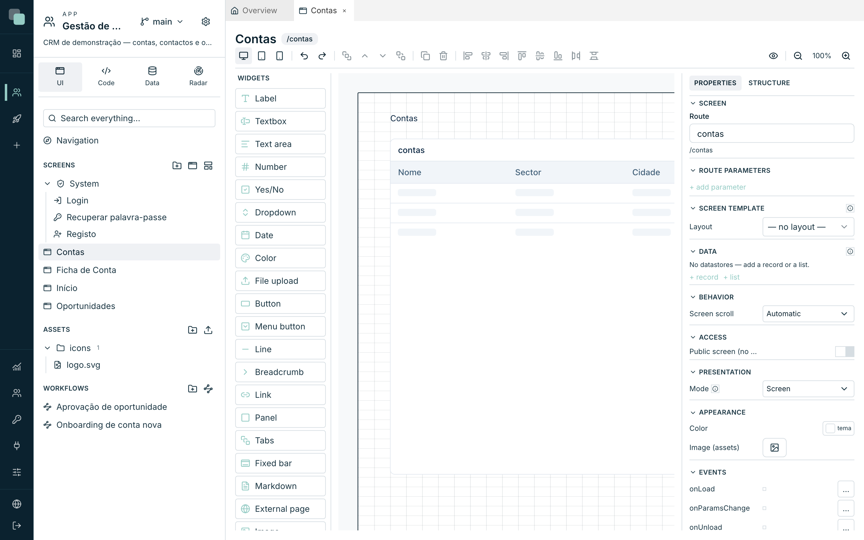
Click an empty area of the canvas (or press Escape) and the inspector switches to the screen itself:
| Section | What it defines |
|---|---|
| Screen | The name and the Route — the screen's path in the app's address (lowercase, numbers and hyphens). |
| Route parameters | The parameters the screen receives in the address (e.g. the account id in /ficha-de-conta/:id). Each one can be Required; the order is adjusted with Move up/Move down. |
| Behavior | Screen scroll — Automatic or No scroll. |
| Access | Public screen (no session) — the screen opens without login; the data comes only from public APIs. |
| Appearance | The page's background: Color, Image (assets) and Fit (Cover, Contain, Stretch, Center, Repeat). |
| Navigation | The Parent screen of a page that is not in any menu (a detail page): the app highlights its menu and keeps the sidebar open. See App navigation. |
| Presentation | Whether the screen is a normal page, a Modal (centered) or a Side panel (right) — detailed in Events and the SDK. With Bar (widget area), the screen is the content of a widget area of the App navigation. |
| Screen template | The associated Layout — see Layouts and per-device design. |
| Data | The screen's datastores — see Datastores and data. |
| Events | The screen's events (onLoad, onParamsChange, onUnload) — see Events and the SDK. |
Warning
Changing the Route changes the screen's address — menus and links that pointed at the old route stop getting there. Check the navigation after touching it.
Why doesn't…?
- Why can't I move a widget? If it shows with a padlock, it comes from a layout — the position is edited on the layout itself, not on the screen. See Layouts and per-device design.
- Why won't the widget snap where I want it? The guides and the grid are beating your gesture — hold Alt to turn snapping off while you drag.
- Why did the widget disappear from the canvas? Check the Structure: it may be hidden (the eye), inside a tab that is not active, or behind another widget (use the layers).