Creating a report
Designing a report — bands, paper and margins, datasets, parameters, elements and rules, and the output as PDF or Excel.
A report is a document printed from the app's data: a listing, an invoice, a month-end statement. It comes out as PDF — paginated, with headers that repeat and totals at the end — or as Excel, and it can be generated by hand, by a screen button, by a script, by a workflow, or by a schedule that emails it.
The model is one of bands: a report is not a screen that grows downwards, it is a sequence of strips the engine repeats according to each one's rule — once, per page, per row, per group. That is what makes pagination possible.
The unit is the millimetre, everywhere. It is the unit of paper and it survives the move from A4 to Letter.
On this page we design the Opportunities by account report of the Customer Management app: the sales pipeline grouped by account, with each account's contacts, the total per account and a chart at the end.
Where reports live
Reports live in the Data minitab of the app tree, below the data sources. Clicking the name opens the design in a tab.
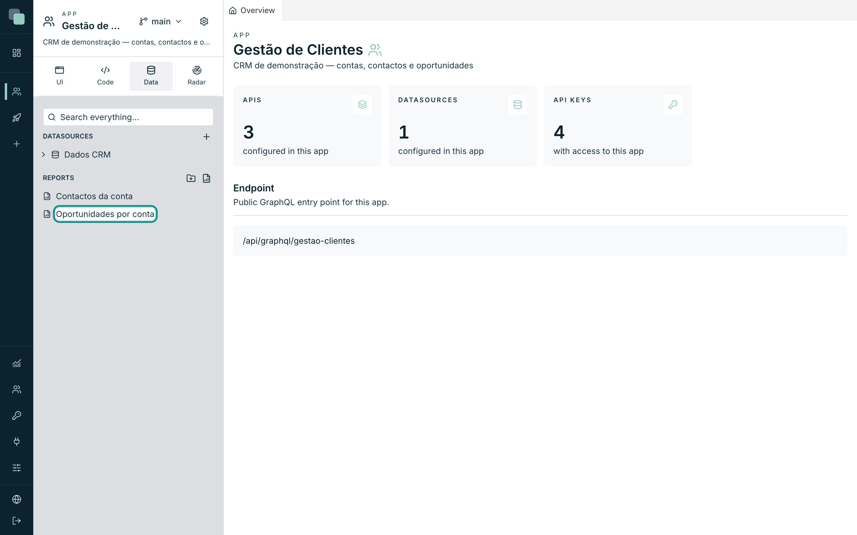
An app with no reports shows "No reports — create one to design it.".
Creating a report
- Hover over the Reports group row and click New report.
- Type the Name — for example
Facturas do mês. - Click Create.
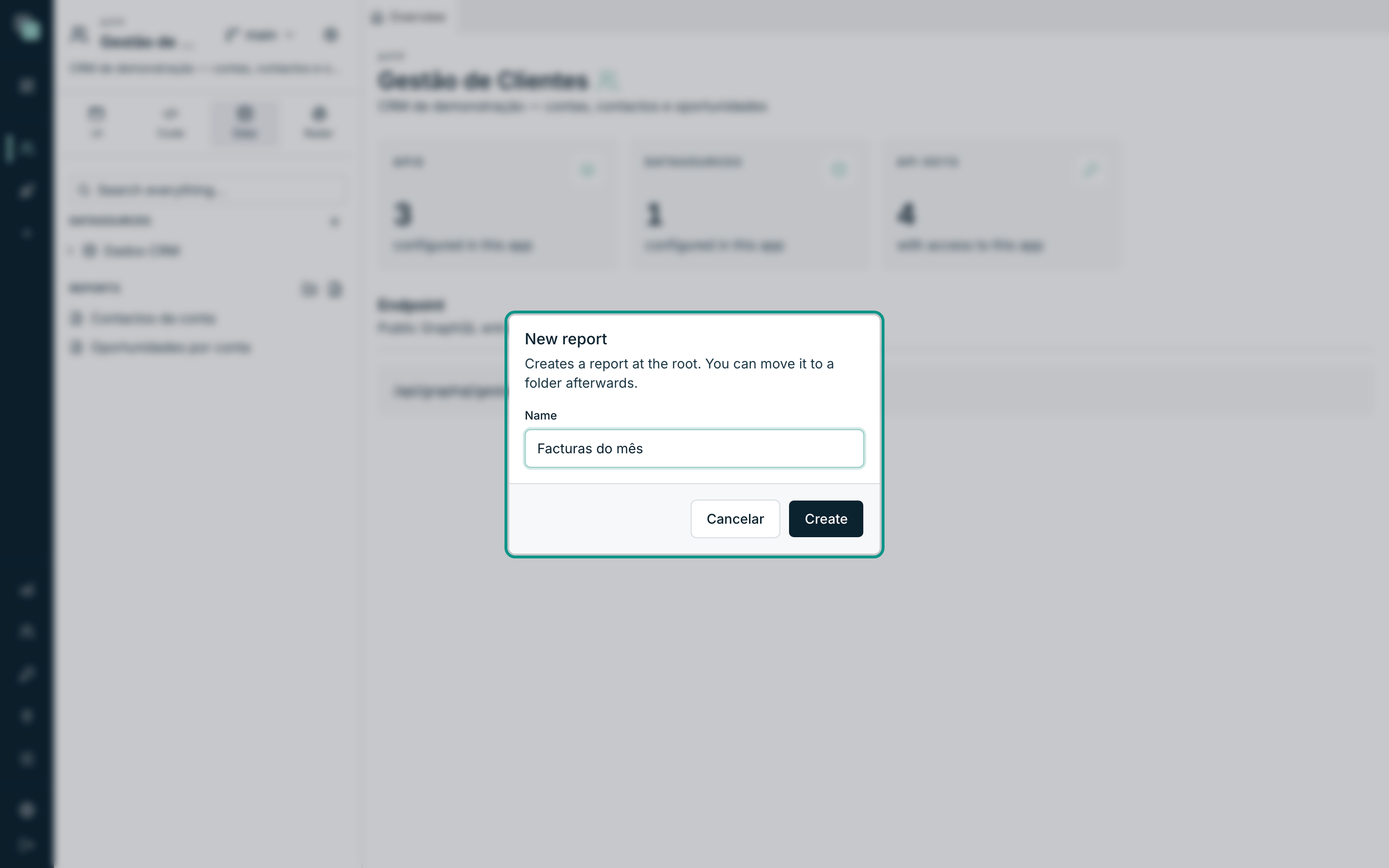
"Creates a report at the root. You can move it to a folder afterwards." The report is born A4 portrait, with the five fixed bands and no data connected, and the design opens right away.
The design
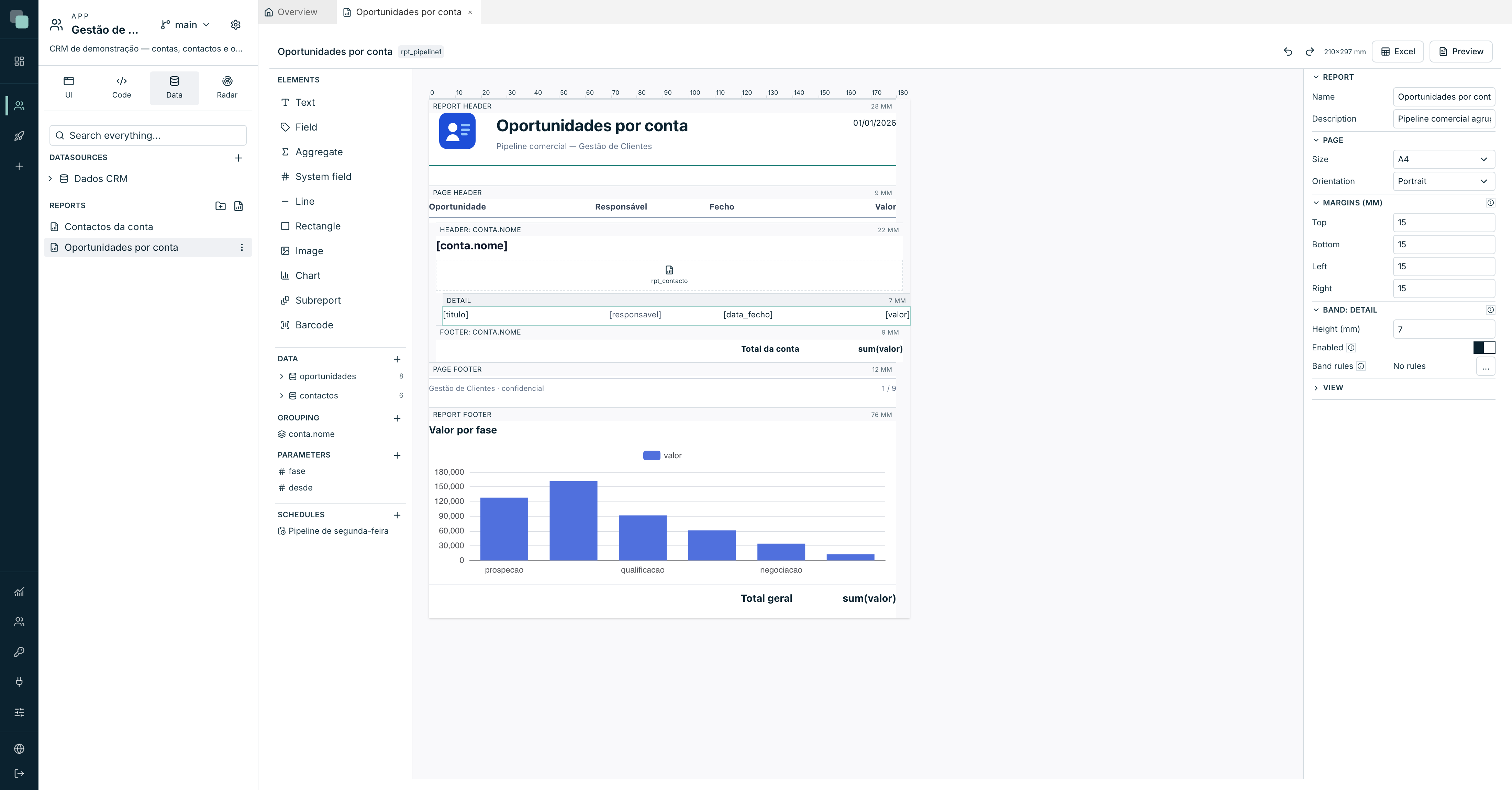
The tab has three columns and a bar at the top:
| Area | What it is |
|---|---|
| The top bar | The name, the report identifier (rpt_…, what code uses to call it), the save state, undo/redo, the paper measurements and the Excel and Preview buttons. |
| Left column | The Elements palette, the Data, the Grouping, the Parameters and the Schedules. |
| Centre | The design surface: a ruler in millimetres and the bands, stacked in the order they come out on paper. |
| Right | The properties — of the report, of the selected band or of the selected element. |
As everywhere else on the platform, there is no save button: the design saves itself.
The header and the toolbar are the same as the screen designer's. In the header: the name, the identifier, the paper size and the save state. In the toolbar: undo and redo; the drawing order (bring to front, forward, backward, send to back, so that a background rectangle sits behind the text); Duplicate and Delete; align (left, centre, right, top, middle, bottom) and distribute (horizontal, vertical); and on the right Excel, Preview and the zoom. With a single element selected, align aligns it to the band (centring a title on the page, for instance); with several, it aligns them to each other, as long as they are in the same band.
The Elements palette groups them by type (Text, Shapes, Media and Structure), with the Search box at the top and the width draggable from the right edge.
The bands
The bands are a fixed set — you don't add strips at will, because each one has a repetition rule of its own that the engine knows by name.
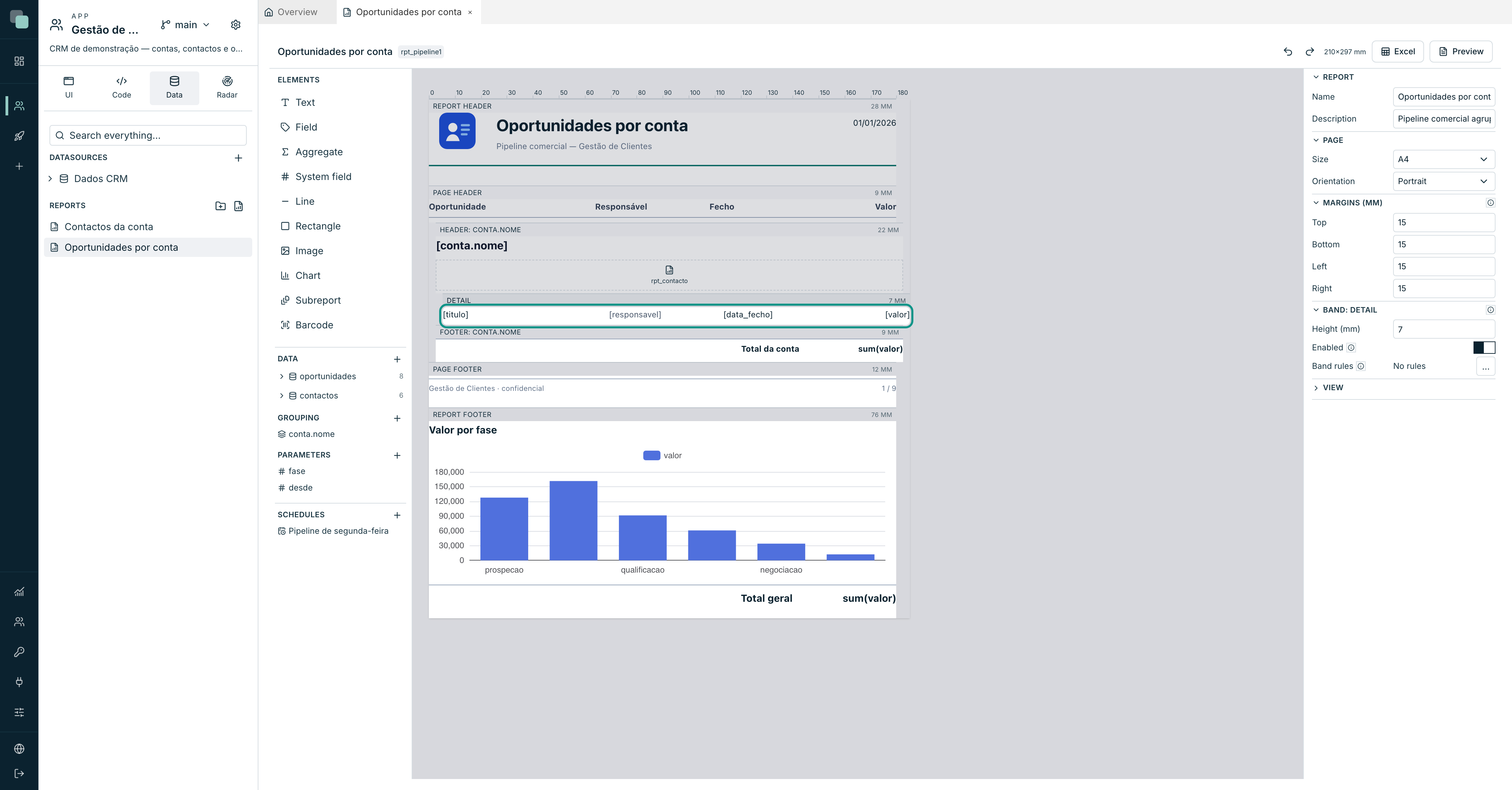
| Band | When it is rendered |
|---|---|
| Report header | "Rendered once, at the start of the first page." Logo, title, issue date. |
| Page header | "Repeats at the top of every page — logo, column headings." |
| Detail | "Rendered once per data row. This is the band that fills the report." |
| Page footer | "Repeats at the bottom of every page — page number, date." |
| Report footer | "Rendered once, at the end — grand totals." It is born disabled. |
To these are added, when there is grouping, one header and one footer per level — see Charts and subreports.
Clicking a band's title selects it; the right-hand panel then shows its properties.
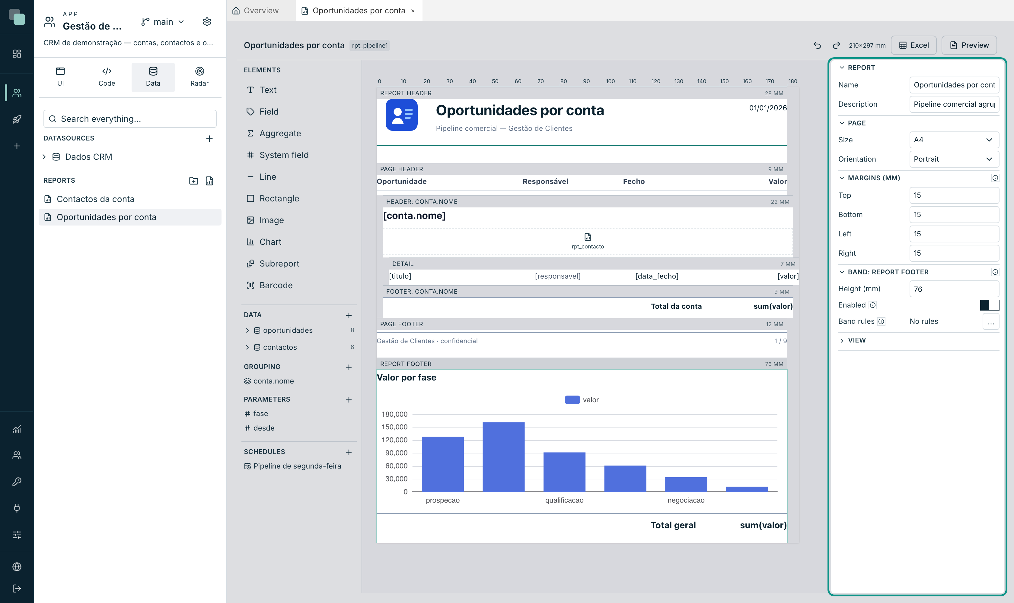
| Property | What it does |
|---|---|
| Height (mm) | The strip's height. You can also drag the dividing line on the design surface. |
| Enabled | "Disabled, the band is not rendered and takes no space." |
| Band rules | Suppress the band from the data. |
About the rules: "suppress the band from the data. Suppressed, it is not rendered and takes no space — this is what replaces having several detail bands". Instead of three detail strips with different conditions, one strip and rules that hide it when it doesn't apply.
The paper
With nothing selected, the right-hand panel shows the report and page properties:
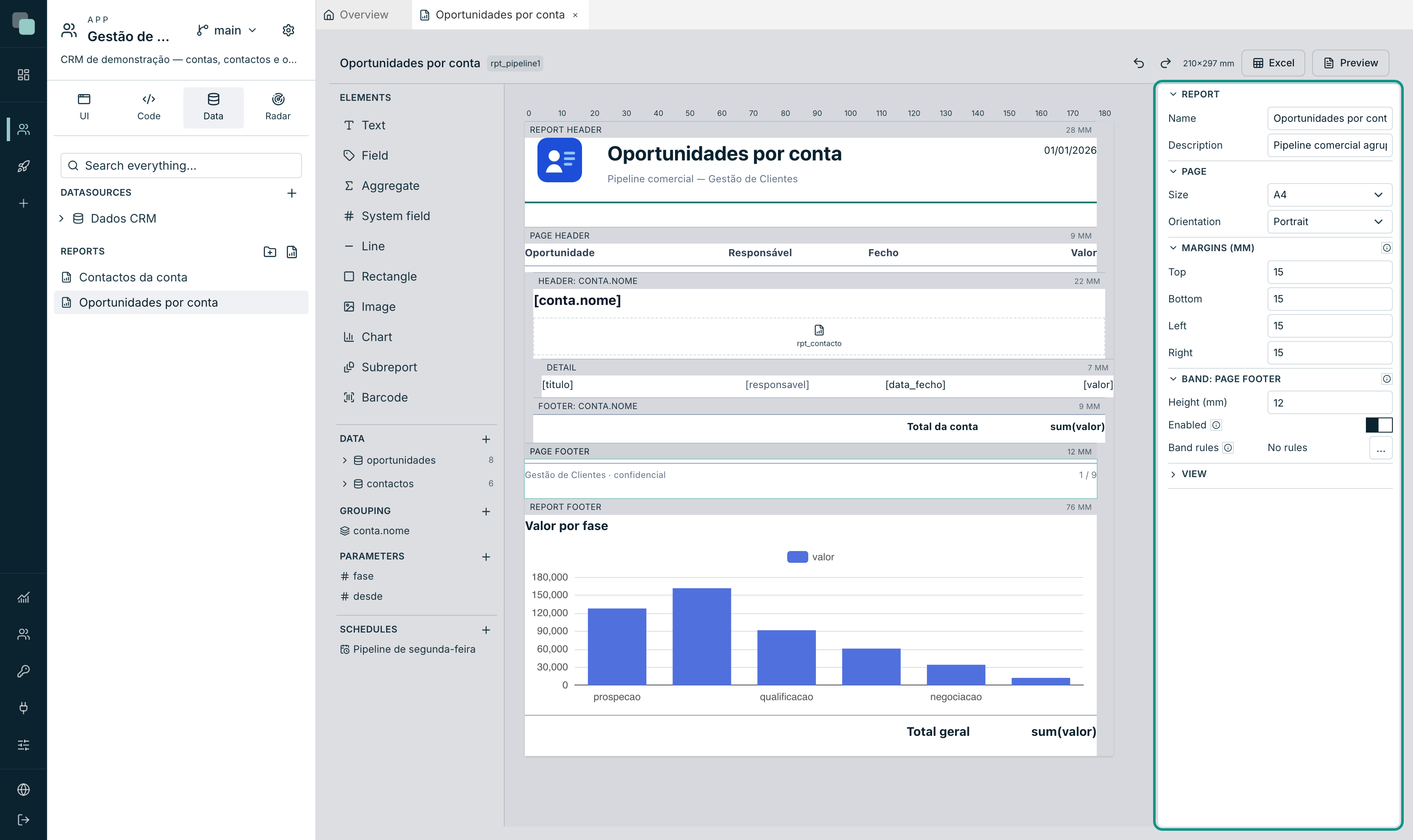
| Field | Options |
|---|---|
| Name / Description | Identification, for whoever builds it. |
| Size | A4, A3, A5, Letter, Legal or Custom (width and height in mm). |
| Orientation | Portrait or Landscape. |
| Margins (mm) | Top, Bottom, Left, Right. |
"The space between paper and content. What is left is the width of the design surface" — changing the margins changes the width you design in, and the ruler follows.
The View section, at the end of the panel, holds the design surface's Zoom. It does not affect the document; it is just the magnifier of whoever is drawing.
The data
A report with no data connected has no fields to drag. Open Datasets with the + on the Data section:
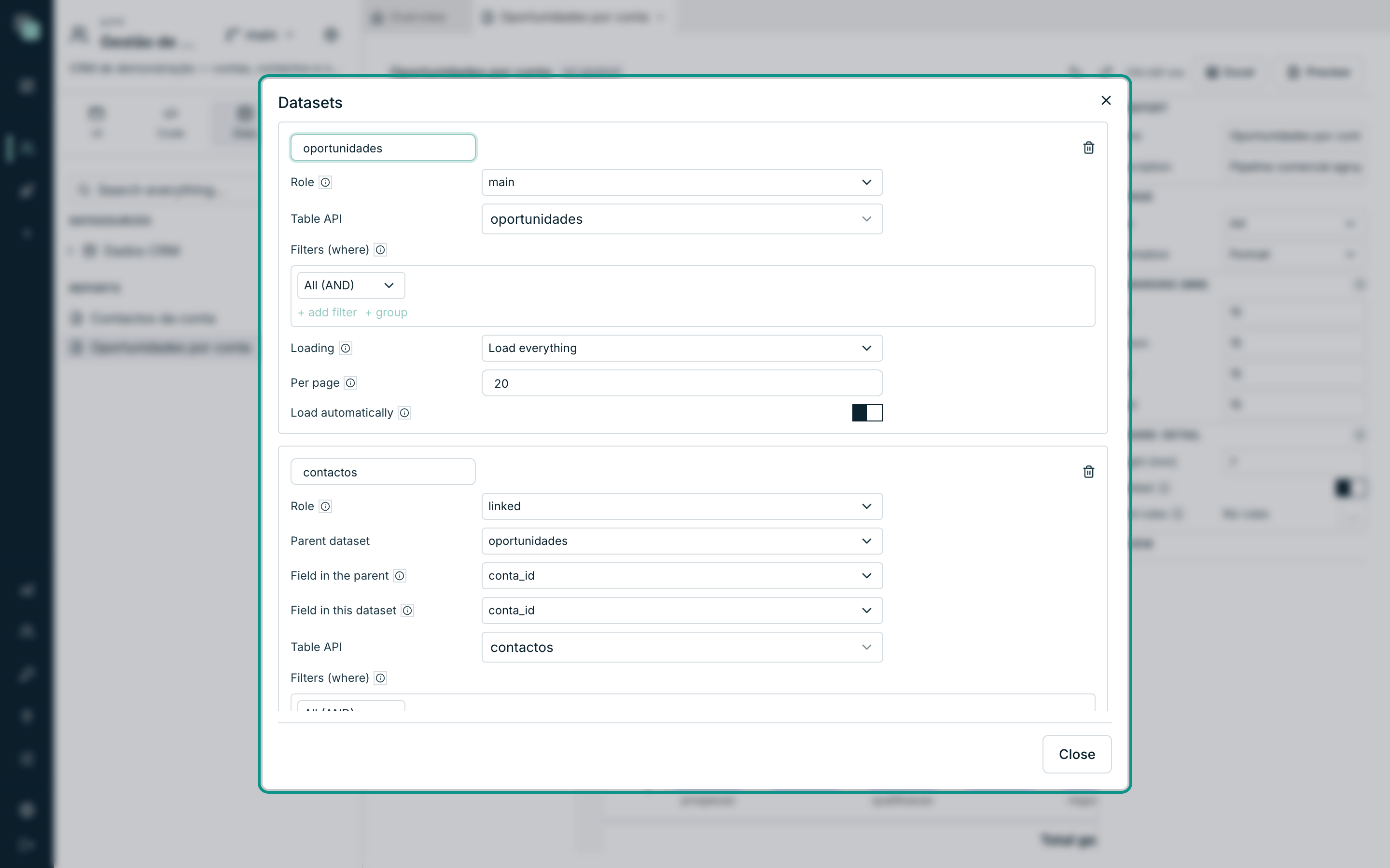
Each dataset has:
| Field | Notes |
|---|---|
| Dataset name | How the elements refer to it (oportunidades, contactos). |
| Role | main, linked or standalone — see the table below. |
| Table API | The app API the rows come from. |
| Filters (where) | The same filter grammar as the rest of the platform. It can compare against the report's parameters. |
| Loading / Per page | How the rows are read. |
The three roles:
| Role | What it means |
|---|---|
| main | "The detail band walks it, one printed row per row of it." There is only one. |
| linked | "Belongs to a row of another dataset through the field you pick — the invoice and its lines." |
| standalone | "Neither walked nor linked, feeds the header or a grand total." |
A linked dataset asks for three more fields: the Parent dataset, the Field in the parent ("the field that identifies the parent row — usually the key") and the Field in this dataset ("the field pointing back at the parent").
Note
The link is a declaration, and that is what makes it fast: the engine loads everything at once and groups it in memory, instead of running one query per row of the main dataset.
In the left column, each dataset appears with its field count and expands with the arrow. Dragging a field onto a band creates a Field element already bound — the fastest way to fill the detail band.
To remove a dataset, hover its row in the left column and click the Remove icon that appears on the right, the same as for groups; there is no need to open the dialog. Undo brings it back.
How many rows, and in which time zone
Each dataset brings up to 20,000 rows. Above that, the report comes out with the first 20,000 and a warning at the end (in the PDF, after the report footer; in Excel, on the last row) that says which dataset was cut. The totals in that report don't count the rows that were left out: use the parameters and the dataset filters to narrow it.
Dates with a time are written in the reader's time zone: the time zone of the browser or phone that opens the report, and the schedule's time zone in a scheduled report. The Issue date too: after midnight in Lisbon it's already the next day, even if the server is in another time zone.
The parameters
Parameters are "values the report receives from whoever runs it" — the month, the stage, the customer. They are used in the dataset filters.
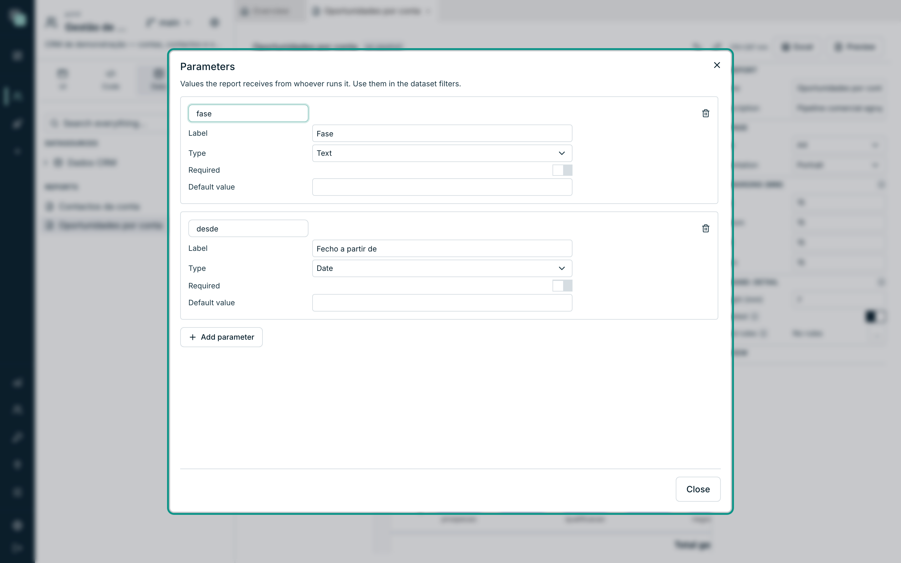
| Field | Notes |
|---|---|
| Name | How the filter and the code refer to it. |
| Label | What is read when the value is asked for. |
| Type | Text, Number, Date or Yes/No. |
| Required | With no value, the report refuses to run. |
| Default value | Used when the caller gives none. |
A parameter is removed the same way: the Remove icon appears when you hover its row in the left column. The same goes for Schedules.
The elements
The Elements palette holds everything you can put on a band. You drag it onto the band; you drop it where it belongs.
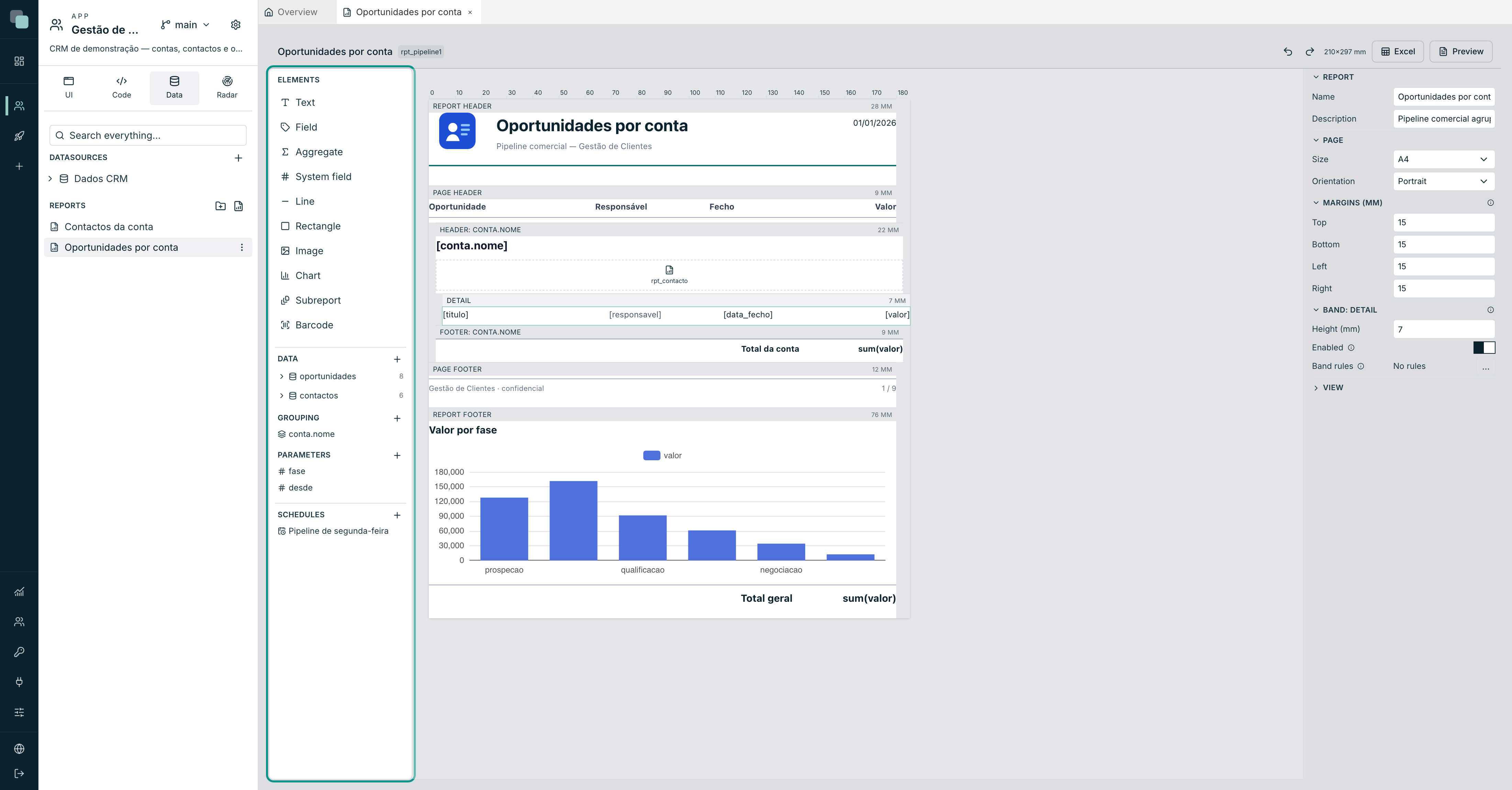
| Element | What it is for |
|---|---|
| Text | Fixed text — titles, labels, footers. |
| Field | The value of a dataset field. It is what dragging a field produces. |
| Aggregate | A calculation over a dataset: Sum, Average, Count, Minimum, Maximum. |
| System field | Page number, Total pages, Page X of Y, Issue date, Report name. |
| Line | Separators and frames. |
| Rectangle | Backgrounds and boxes, with fill, border and corners. |
| Image | An app file, a URL, or the contents of a field. |
| Chart | Nine types, with the same data as the screens. |
| Subreport | Another report drawn inside this one. |
| Barcode | Code 128, EAN-13 or QR. |
The last three have a page of their own: Charts and subreports.
An element's properties
Click an element on the design surface:
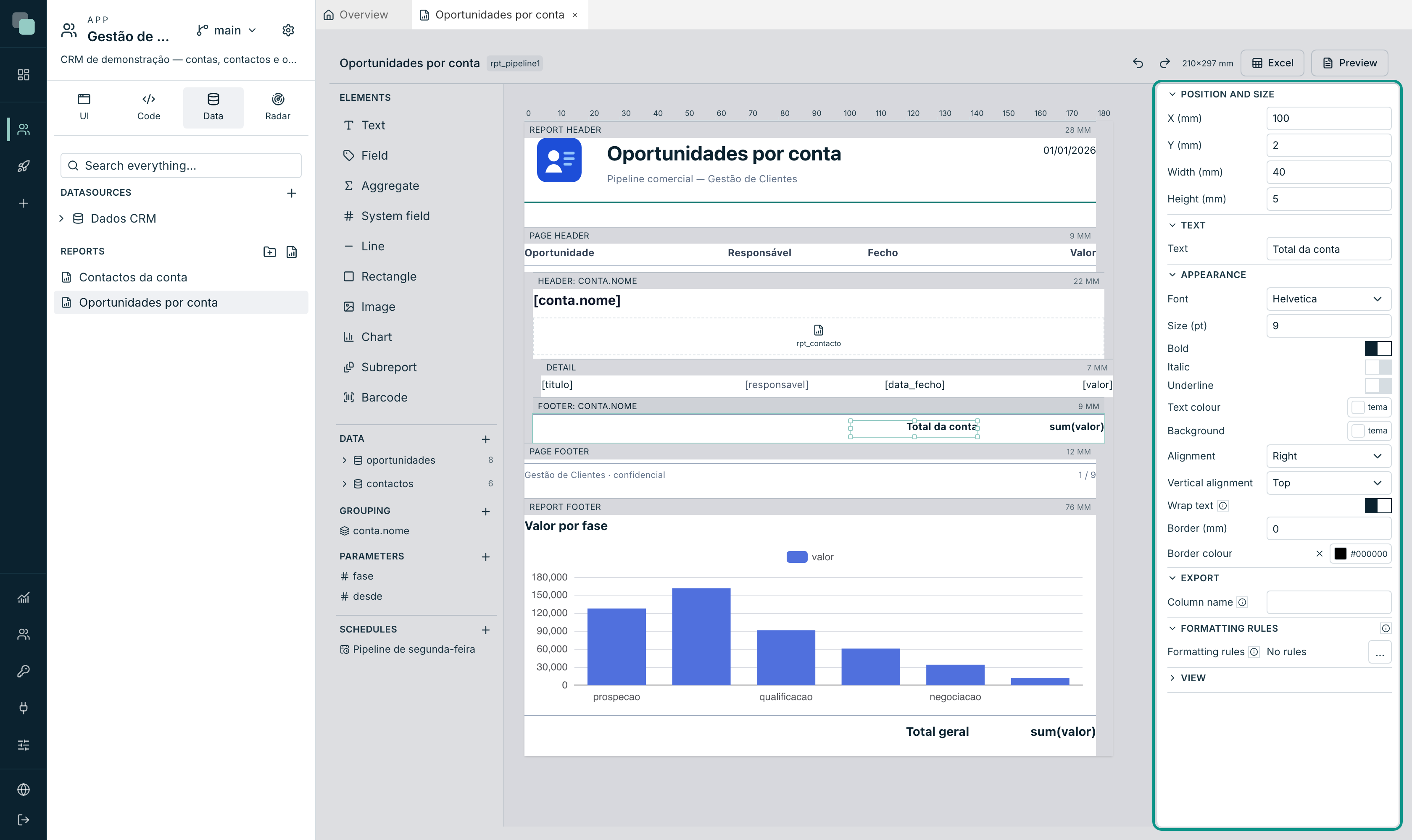
| Section | What it holds |
|---|---|
| Position and size | X (mm), Y (mm), Width (mm), Height (mm). The y counts from the top of the band. |
| Appearance | Font, Size (pt), bold/italic/underline, alignment, Vertical alignment, colour, Fill, Border (mm) and Border colour, Wrap text. |
| Format (fields and aggregates) | Display mask, same grammar as the table columns. |
| Export | The Column name in Excel. "Empty uses the field name. It does not appear on paper — there the heading is a text you place wherever you want." |
| Formatting rules | See below. |
About Wrap text: "off, text that does not fit is clipped instead of wrapping to the next line" — which is what you want in a table column, so one long line doesn't push the whole page around.
Selecting several elements (with the selection box or with Shift), the
panel says how many there are and moves them together, with the mouse or with
the arrow keys.
Formatting rules
Every element can have rules that "change the look from the row's data: paint an overdue value, hide a label, make a total bold when it is negative". They are the same engine and the same editor as the widget rules.
The last rule that matches wins — order them from the most general to the most specific.
Seeing the result
Two buttons, in the top right corner:
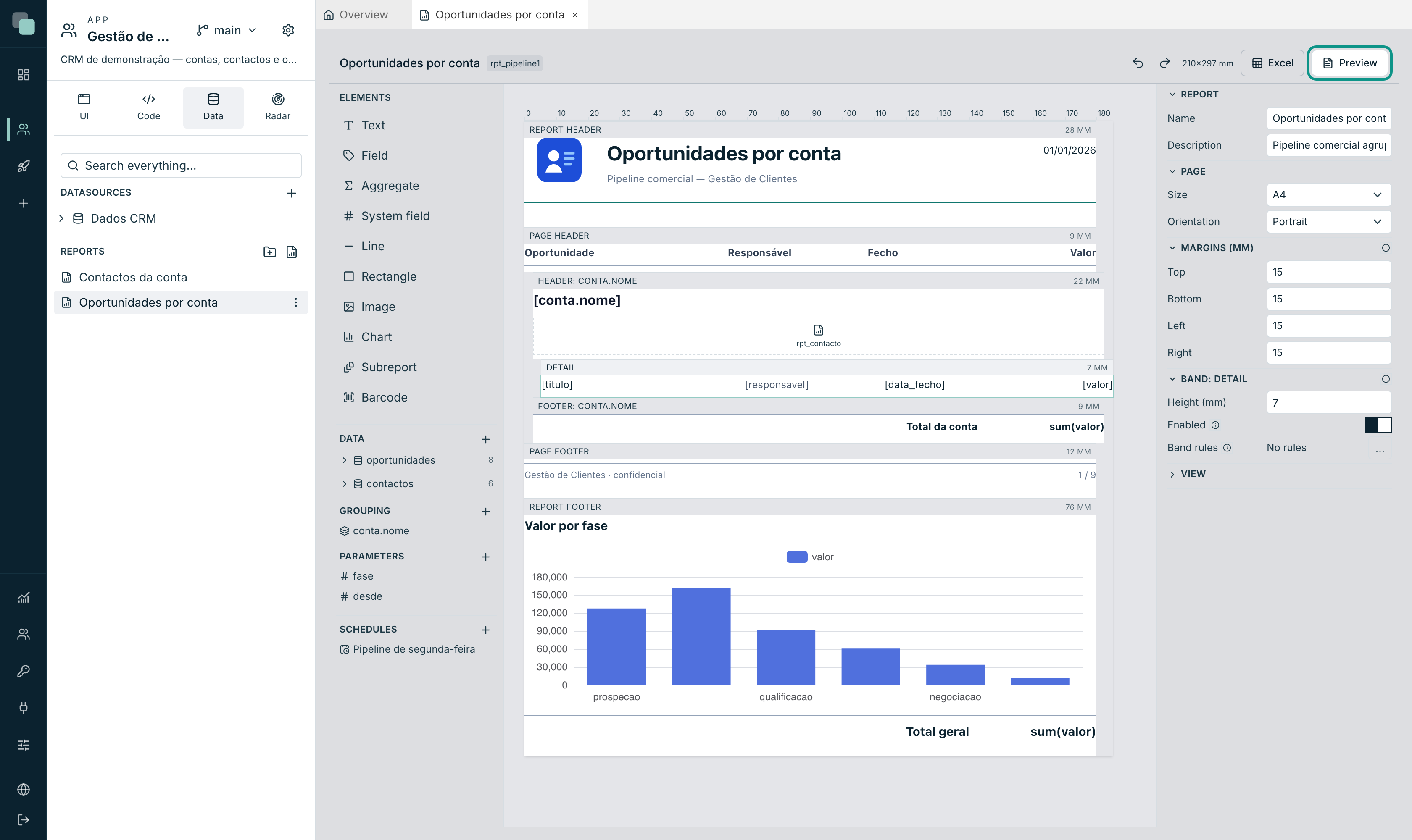
- Preview generates the PDF with the app's real data and opens it right there, paginated. That is how you check the design: what fits on the design surface doesn't always fit on the page.
- Excel generates the spreadsheet and downloads it. There are no bands or pages here: out comes a table, with one column per element of the detail band, and the headings come from each one's Column name.
If the report has required parameters, they are asked for before it is generated.
Tip
Design for the PDF and check in Excel, not the other way round. The PDF is the demanding format — margins, page breaks, bands that don't fit. Excel forgives almost everything.
Frequently asked questions
The detail band comes out empty. There is no main dataset, or its filter returns no rows. Open Datasets and confirm there is one with the main role, and that the parameters its filter uses have values.
A field in a header band comes out empty. That is expected outside the group bands. In the Report header and the Report footer there is no "current row" — showing the very first one would be inventing a value. In a group header, the field reads the group's first row, which is what you want.
The report is slow or gets truncated. Each dataset has a ceiling of rows per read. Filter more — by date, by status — instead of printing the whole table. A 4,000-page report is read by nobody.
I need more than a schedule knows how to do.
Write a Python script and call reports.render(...) — see
Scheduling and sending.